Distributed lags (and hierarchical distributed lags) using mgcv and mvgam
By Nicholas Clark in rstats mgcv mvgam
August 15, 2023
Here we will use mgcv to estimate parameters of nonlinear distributed lag models. These models are used to describe simultaneously non-linear and delayed functional relationships between a covariate and a response, and are sometimes referred to as exposure-lag-response models. If we assume \(\tilde{\boldsymbol{y}}_{t}\) is the conditional expectation of a response variable \(\boldsymbol{y}\) at time \(\boldsymbol{t}\), and that \(g\) is a suitable inverse link function, the linear predictor for a distributed lag GAM with one lagged covariate is written as:
$$g(\tilde{\boldsymbol{y}}_{t})={\boldsymbol{B}}_0+\sum\limits_{k=1}^K{f}(\boldsymbol{b}_{k,t}\boldsymbol{x}_{k,t})\,$$
where \(\boldsymbol{B}_{0}\) is the unknown intercept and the \(\boldsymbol{b}\)’s are unknown spline coefficients estimating how the functional effect of covariate \(\boldsymbol{x}\) on \(g(\tilde{\boldsymbol{y}}_{t})\) changes over increasing lags (up to a maximum lag of \(\boldsymbol{K}\)).
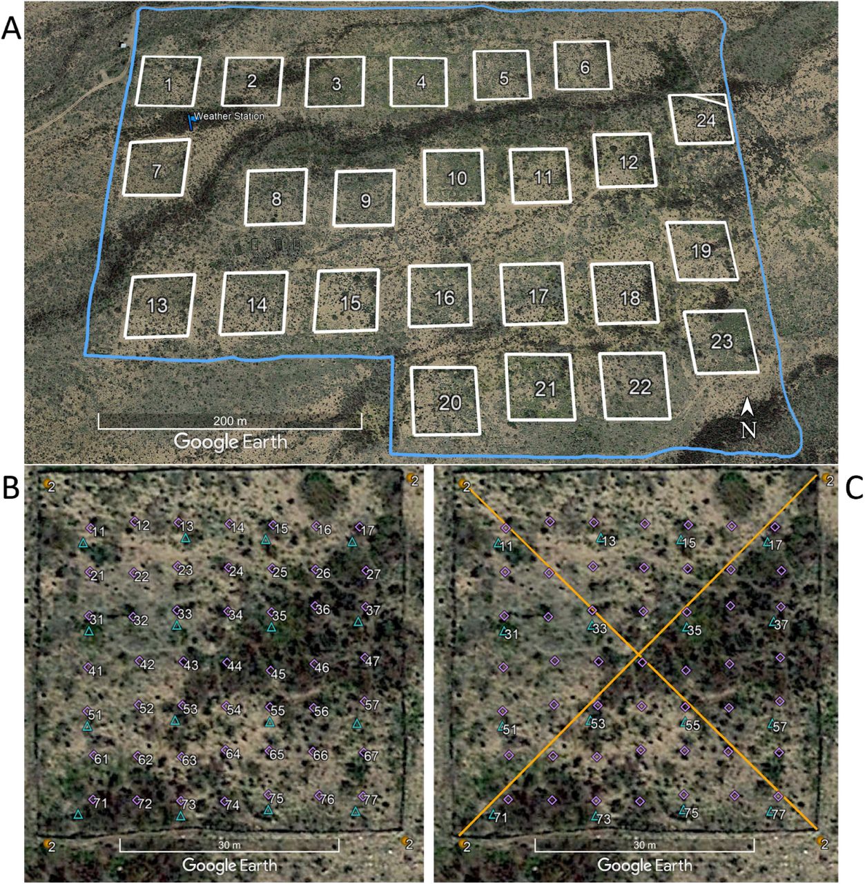
We will work with time series of rodent captures from the Portal Project, a long-term monitoring study based near the town of Portal, Arizona. Researchers have been operating a standardized set of baited traps within 24 experimental plots at this site since the 1970’s. Sampling follows the lunar monthly cycle, with observations occurring on average about 28 days apart. However, missing observations do occur due to difficulties accessing the site (weather events, COVID disruptions etc..). You can read about the full sampling protocol in this preprint by Ernest et al on the Biorxiv.
Environment setup
This tutorial relies on the following packages:
library(mvgam)           # Fit, interrogate and forecast DGAMs
library(dplyr)           # Tidy and flexible data manipulation
library(ggplot2)         # Flexible plotting
library(gratia)          # Graceful plotting of smooth terms
library(viridis)         # Plotting colours
library(patchwork)       # Combining ggplot objects
A custom ggplot2 theme; feel free to ignore if you have your own plot preferences
theme_set(theme_classic(base_size = 12, base_family = 'serif') +
            theme(axis.line.x.bottom = element_line(colour = "black",
                                                    size = 1),
                  axis.line.y.left = element_line(colour = "black",
                                                  size = 1)))
## Warning: The `size` argument of `element_line()` is deprecated as of ggplot2 3.4.0.
## ℹ Please use the `linewidth` argument instead.
## This warning is displayed once every 8 hours.
## Call `lifecycle::last_lifecycle_warnings()` to see where this warning was
## generated.
options(ggplot2.discrete.colour = c("#A25050",
                                    "#8F2727",
                                    'darkred',
                                    "#630000"),
        ggplot2.discrete.fill = c("#A25050",
                                  "#8F2727",
                                  'darkred',
                                  "#630000"))
Load and inspect the Portal data
All data from the Portal Project are made openly available in near real-time so that they can provide the maximum benefit to scientific research and outreach ( a set of open-source software tools make data readily accessible). These data are extremely rich, containing monthly counts of rodent captures for >20 species. But rather than accessing the raw data, we will use some data that I have already processed and put into a simple, usable form
portal_ts <- read.csv('https://raw.githubusercontent.com/nicholasjclark/EFI_seminar/main/data/portal_data.csv', as.is = T)
Inspect the data structure, which contains lunar monthly total captures across control plots for four different rodent species. It also contains a 12-month moving average of the unitless NDVI vegetation index, and monthly average minimum temperature (already scaled to unit variance)
dplyr::glimpse(portal_ts)
## Rows: 320
## Columns: 5
## $ captures  <int> 20, 2, 0, 0, NA, NA, NA, NA, 36, 5, 0, 0, 40, 3, 0, 1, 29, 3…
## $ time      <int> 1, 1, 1, 1, 2, 2, 2, 2, 3, 3, 3, 3, 4, 4, 4, 4, 5, 5, 5, 5, …
## $ species   <chr> "DM", "DO", "PB", "PP", "DM", "DO", "PB", "PP", "DM", "DO", …
## $ ndvi_ma12 <dbl> -0.172144125, -0.172144125, -0.172144125, -0.172144125, -0.2…
## $ mintemp   <dbl> -0.79633807, -0.79633807, -0.79633807, -0.79633807, -1.33471…
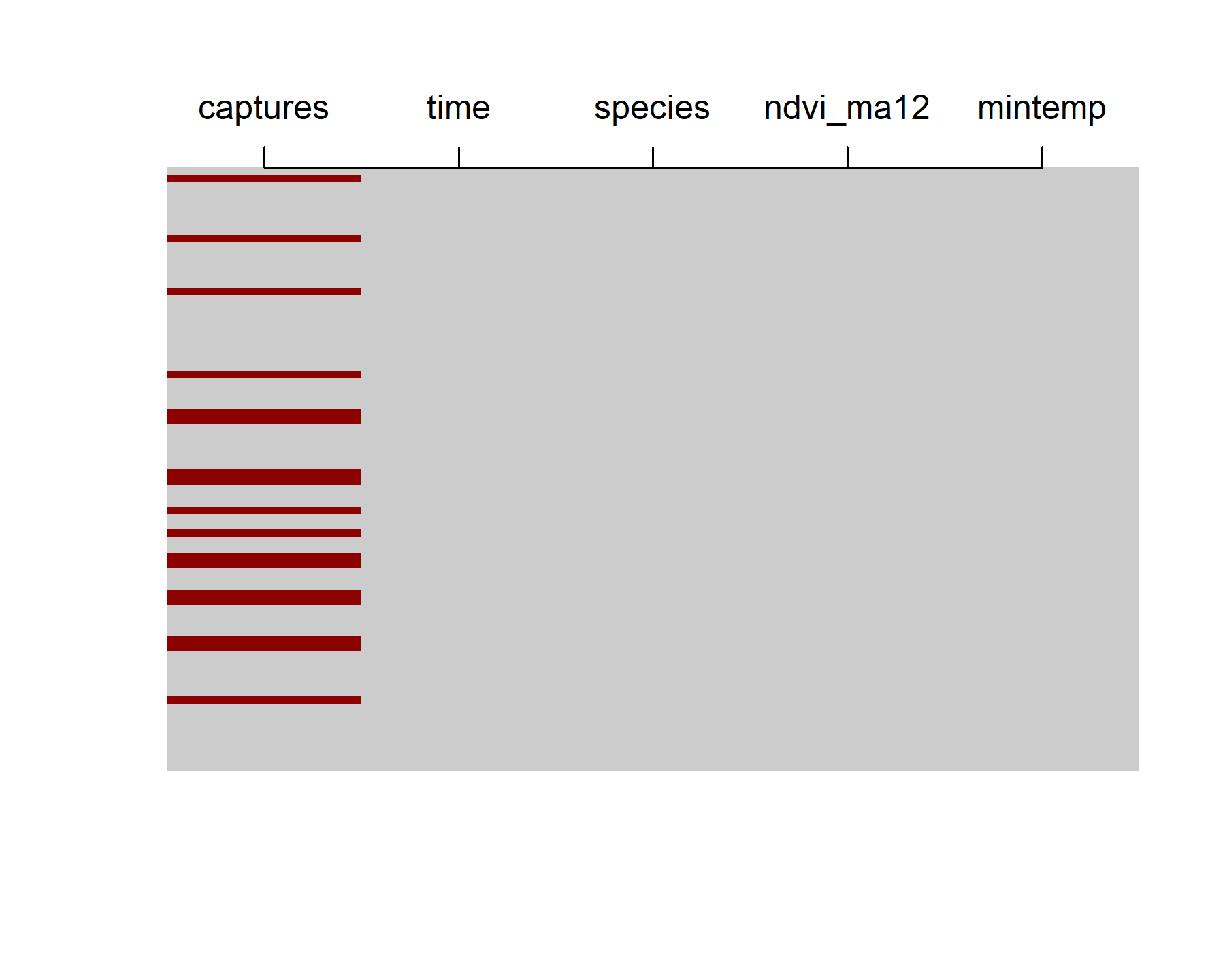
The data contain 80 lunar monthly observations, though there are plenty of NAs in the number of total captures (NAs are shown as red bars in the below plot)
max(portal_ts$time)
## [1] 80
image(is.na(t(portal_ts %>%
                dplyr::arrange(dplyr::desc(time)))), axes = F,
      col = c('grey80', 'darkred'))
axis(3, at = seq(0,1, len = NCOL(portal_ts)),
     labels = colnames(portal_ts))
The data are already in ’long’ format, meaning each series x time observation has its own entry in the data.frame. But {mvgam} needs a series column that acts as a factor indicator for the time series. Add one using {dplyr} commands:
portal_ts %>%
  dplyr::mutate(series = as.factor(species)) -> portal_ts
dplyr::glimpse(portal_ts)
## Rows: 320
## Columns: 6
## $ captures  <int> 20, 2, 0, 0, NA, NA, NA, NA, 36, 5, 0, 0, 40, 3, 0, 1, 29, 3…
## $ time      <int> 1, 1, 1, 1, 2, 2, 2, 2, 3, 3, 3, 3, 4, 4, 4, 4, 5, 5, 5, 5, …
## $ species   <chr> "DM", "DO", "PB", "PP", "DM", "DO", "PB", "PP", "DM", "DO", …
## $ ndvi_ma12 <dbl> -0.172144125, -0.172144125, -0.172144125, -0.172144125, -0.2…
## $ mintemp   <dbl> -0.79633807, -0.79633807, -0.79633807, -0.79633807, -1.33471…
## $ series    <fct> DM, DO, PB, PP, DM, DO, PB, PP, DM, DO, PB, PP, DM, DO, PB, …
levels(portal_ts$series)
## [1] "DM" "DO" "PB" "PP"
It is important that the number of levels matches the number of unique series in the data to ensure indexing across series works properly in the underlying modelling functions. For more information on how to format data for {mvgam} modelling, see
the data formatting vignette in the package
Now we can plot all of the time series together, using the captures measurement as our outcome variable
plot_mvgam_series(data = portal_ts, y = 'captures', series = 'all')
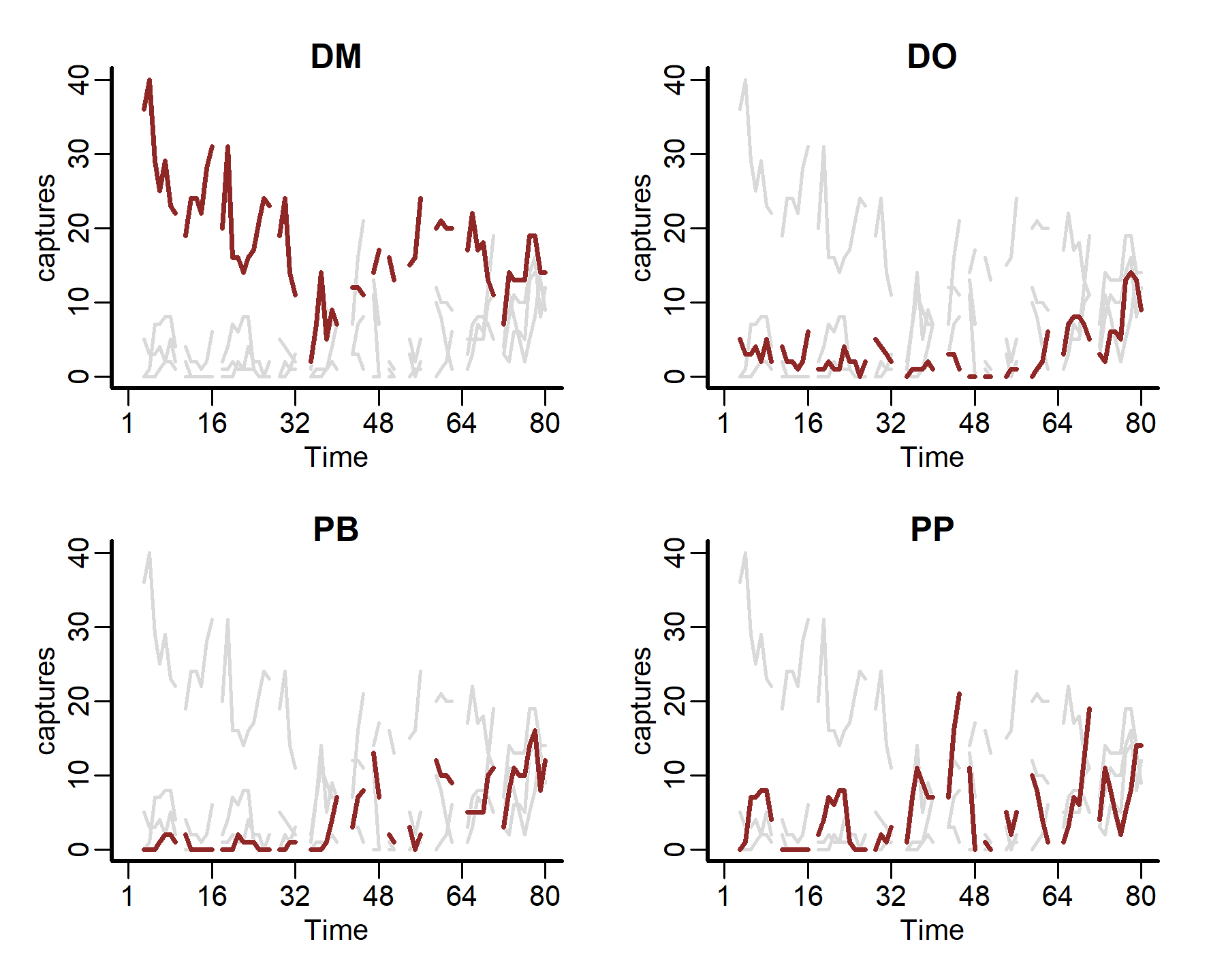
We can also plot some more in-depth features for individual series
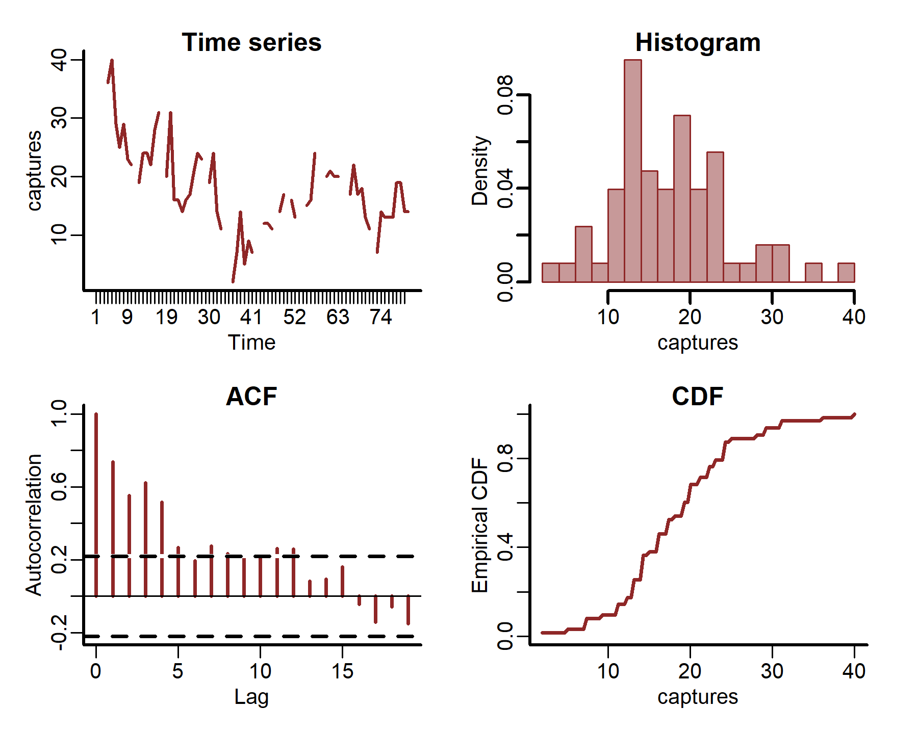
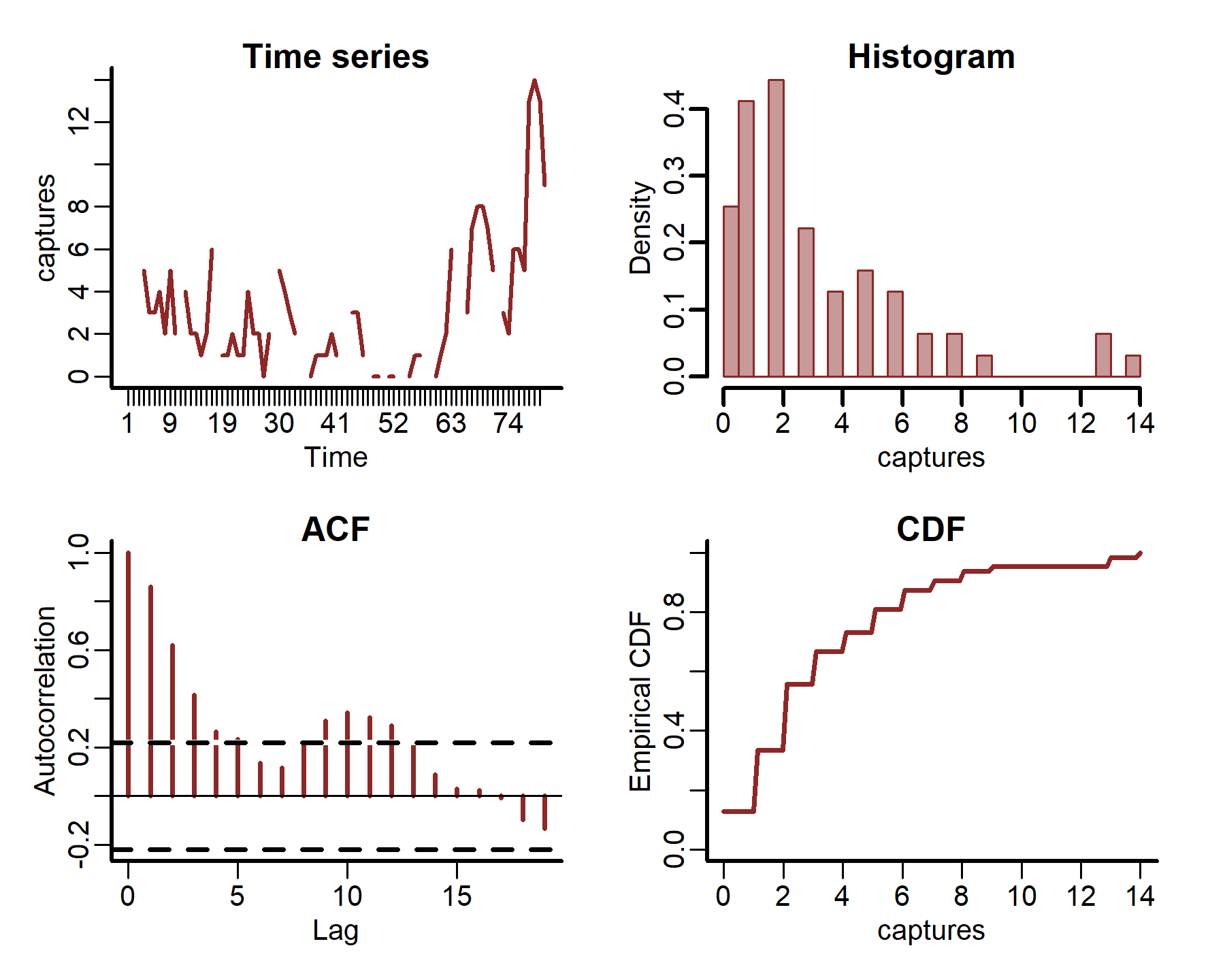
plot_mvgam_series(data = portal_ts, y = 'captures', series = 1)
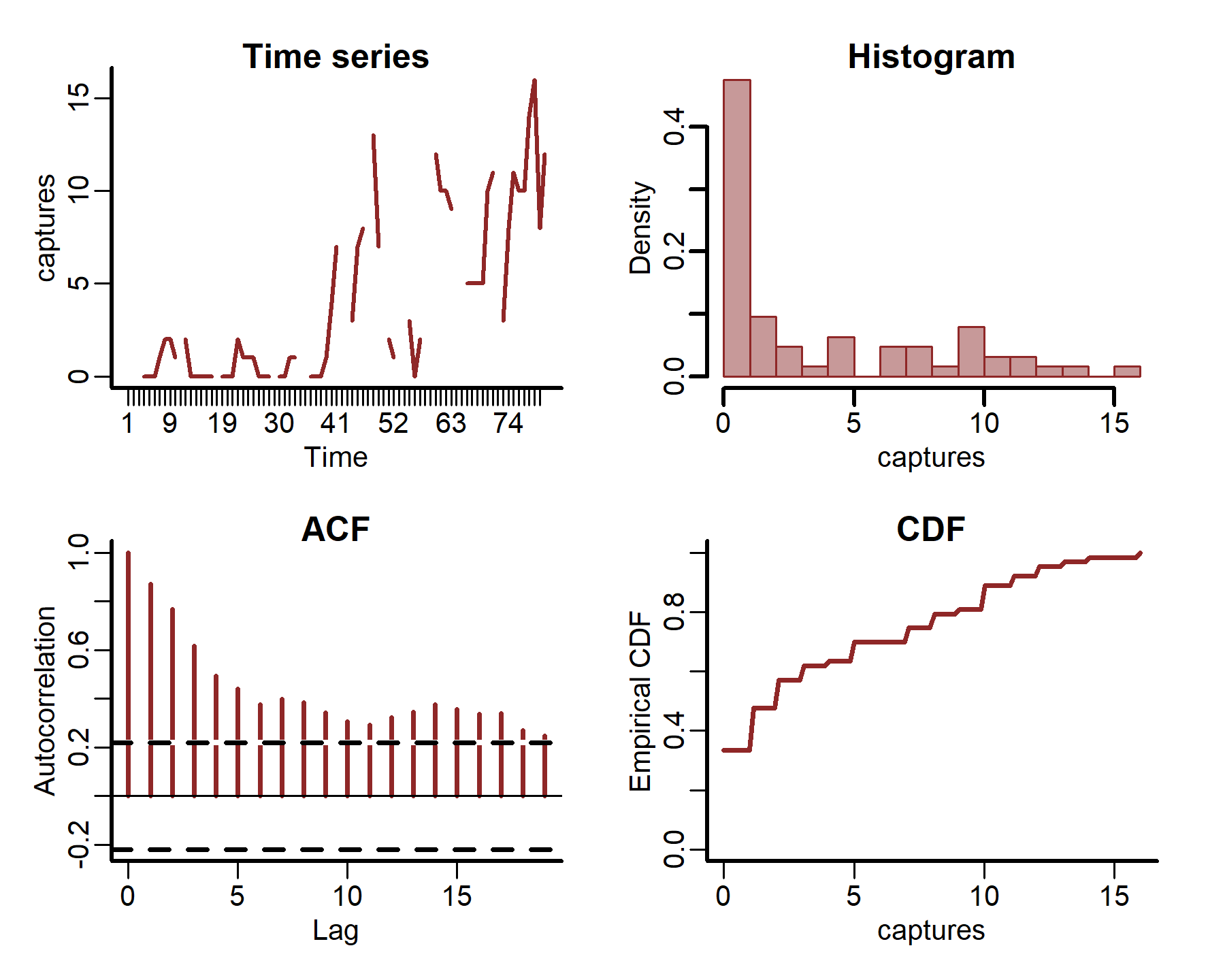
plot_mvgam_series(data = portal_ts, y = 'captures', series = 2)
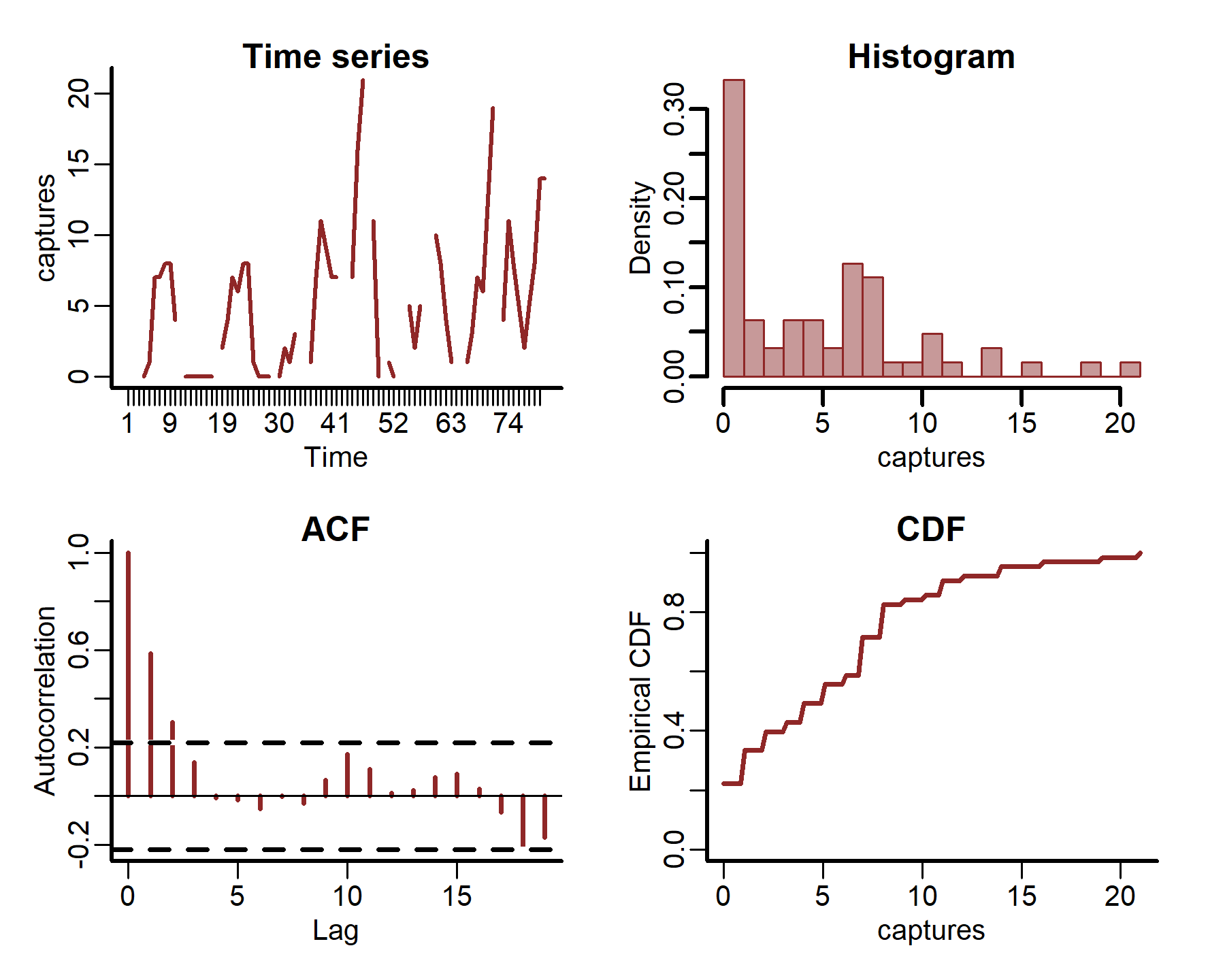
plot_mvgam_series(data = portal_ts, y = 'captures', series = 3)
plot_mvgam_series(data = portal_ts, y = 'captures', series = 4)
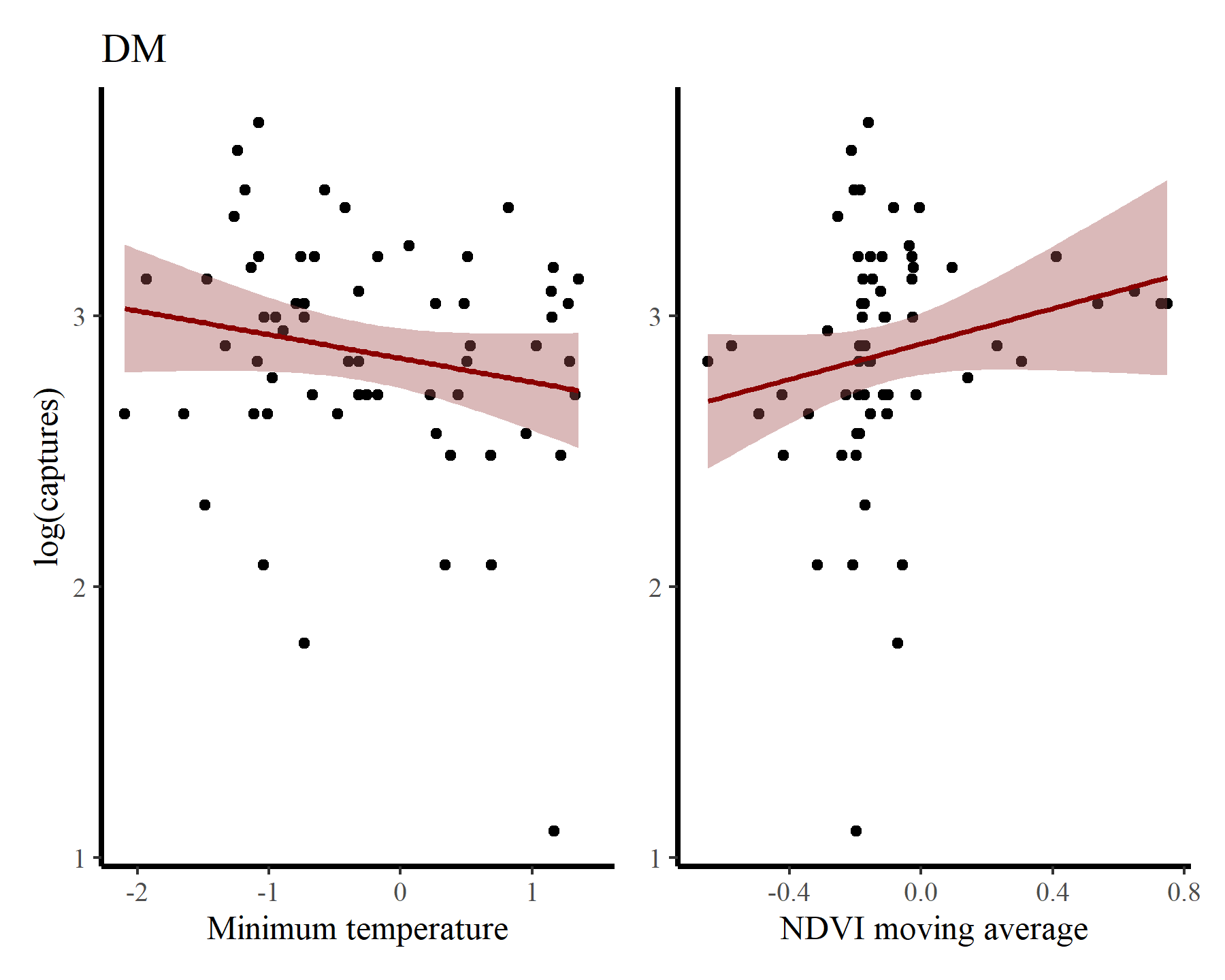
Inspect some associations between log(captures + 1) and minimum temperature / NDVI moving average for each species to get a sense of how their relative abundances vary over seasons and with varying habitat conditions. First for DM
portal_ts %>%
  dplyr::filter(species == 'DM') %>%
  ggplot(aes(x = mintemp, y = log(captures + 1))) +
  geom_point() +
  geom_smooth(method = "gam", formula = y ~ s(x, k = 12),
              col = 'darkred', fill = "#A25050") +
  labs(title = 'DM',
       y = "log(captures)",
       x = 'Minimum temperature') +

  portal_ts %>%
  dplyr::filter(species == 'DM') %>%
  ggplot(aes(x = ndvi_ma12, y = log(captures + 1))) +
  geom_point() +
  geom_smooth(method = "gam", formula = y ~ s(x, k = 12),
              col = 'darkred', fill = "#A25050") +
  labs(y = NULL,
       x = 'NDVI moving average')
## Warning: Removed 17 rows containing non-finite outside the scale range
## (`stat_smooth()`).
## Warning: Removed 17 rows containing missing values or values outside the scale range
## (`geom_point()`).
## Warning: Removed 17 rows containing non-finite outside the scale range
## (`stat_smooth()`).
## Warning: Removed 17 rows containing missing values or values outside the scale range
## (`geom_point()`).
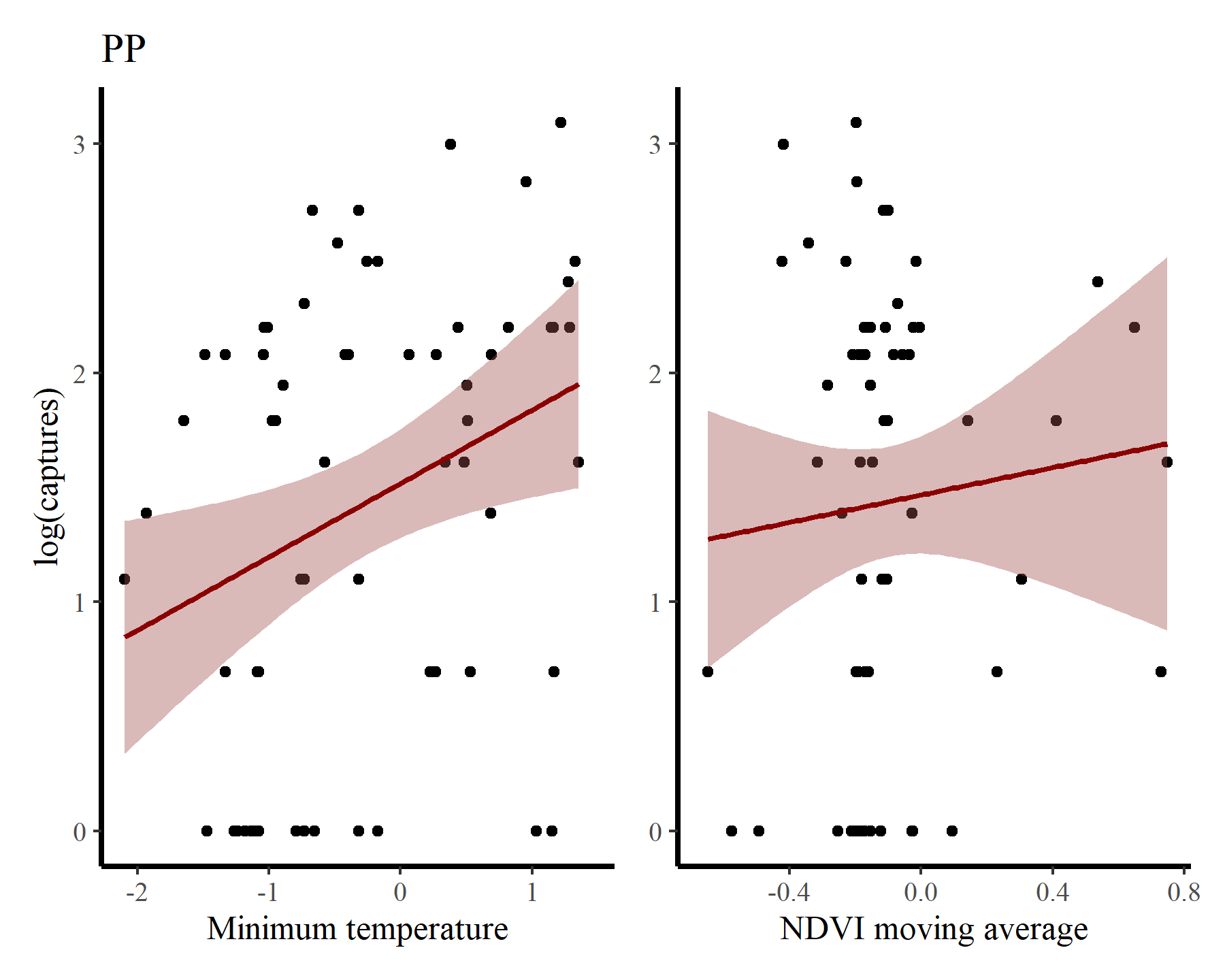
And for PP
portal_ts %>%
  dplyr::filter(species == 'PP') %>%
  ggplot(aes(x = mintemp, y = log(captures + 1))) +
  geom_point() +
  geom_smooth(method = "gam", formula = y ~ s(x, k = 12),
              col = 'darkred', fill = "#A25050") +
  labs(title = 'PP',
       y = "log(captures)",
       x = 'Minimum temperature') +

  portal_ts %>%
  dplyr::filter(species == 'PP') %>%
  ggplot(aes(x = ndvi_ma12, y = log(captures + 1))) +
  geom_point() +
  geom_smooth(method = "gam", formula = y ~ s(x, k = 12),
              col = 'darkred', fill = "#A25050") +
  labs(y = NULL,
       x = 'NDVI moving average')
## Warning: Removed 17 rows containing non-finite outside the scale range
## (`stat_smooth()`).
## Warning: Removed 17 rows containing missing values or values outside the scale range
## (`geom_point()`).
## Warning: Removed 17 rows containing non-finite outside the scale range
## (`stat_smooth()`).
## Warning: Removed 17 rows containing missing values or values outside the scale range
## (`geom_point()`).
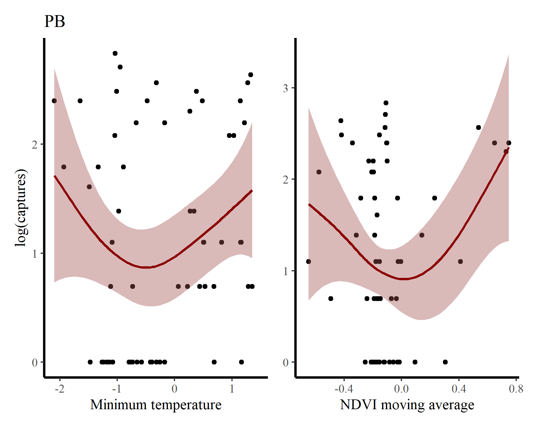
Next for PB
portal_ts %>%
  dplyr::filter(species == 'PB') %>%
  ggplot(aes(x = mintemp, y = log(captures + 1))) +
  geom_point() +
  geom_smooth(method = "gam", formula = y ~ s(x, k = 12),
              col = 'darkred', fill = "#A25050") +
  labs(title = 'PB',
       y = "log(captures)",
       x = 'Minimum temperature') +

  portal_ts %>%
  dplyr::filter(species == 'PB') %>%
  ggplot(aes(x = ndvi_ma12, y = log(captures + 1))) +
  geom_point() +
  geom_smooth(method = "gam", formula = y ~ s(x, k = 12),
              col = 'darkred', fill = "#A25050") +
  labs(y = NULL,
       x = 'NDVI moving average')
## Warning: Removed 17 rows containing non-finite outside the scale range
## (`stat_smooth()`).
## Warning: Removed 17 rows containing missing values or values outside the scale range
## (`geom_point()`).
## Warning: Removed 17 rows containing non-finite outside the scale range
## (`stat_smooth()`).
## Warning: Removed 17 rows containing missing values or values outside the scale range
## (`geom_point()`).
And finally for DO
portal_ts %>%
  dplyr::filter(species == 'DO') %>%
  ggplot(aes(x = mintemp, y = log(captures + 1))) +
  geom_point() +
  geom_smooth(method = "gam", formula = y ~ s(x, k = 12),
              col = 'darkred', fill = "#A25050") +
  labs(title = 'DO',
       y = "log(captures)",
       x = 'Minimum temperature') +

  portal_ts %>%
  dplyr::filter(species == 'DO') %>%
  ggplot(aes(x = ndvi_ma12, y = log(captures + 1))) +
  geom_point() +
  geom_smooth(method = "gam", formula = y ~ s(x, k = 12),
              col = 'darkred', fill = "#A25050") +
  labs(y = NULL,
       x = 'NDVI moving average')
## Warning: Removed 17 rows containing non-finite outside the scale range
## (`stat_smooth()`).
## Warning: Removed 17 rows containing missing values or values outside the scale range
## (`geom_point()`).
## Warning: Removed 17 rows containing non-finite outside the scale range
## (`stat_smooth()`).
## Warning: Removed 17 rows containing missing values or values outside the scale range
## (`geom_point()`).
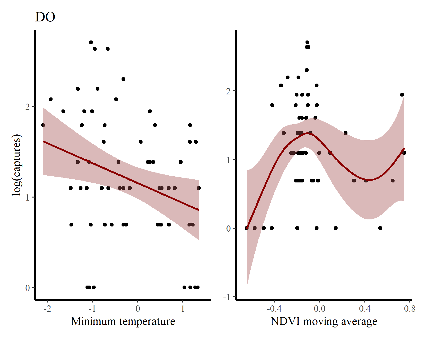
There may be some support for some nonlinear effects here, but we know that the rodents in this system do not show immediate responses to climatic or environmental changes. Rather, these responses are often delayed, and can be thought of as cumulative responses to varying conditions over a period of months. How can we capture these effects using GAMs? This is where distributed lag models come in.
Setting up lag matrices
A lesser-known feature of mgcv is its ability to handle data in list format as opposed to the traditional data.frame format that most regression packages in R use. This allows us to supply some (or all) of our covariates as matrices rather than vectors, and opens many possibilities for more complex modeling. You can read a bit more about this using ?gam.models and looking at the section on Linear functional terms. We can make use of this to set up the objects needed for estimating nonlinear distributed lag functions.
Below is an exact reproduction of Simon Wood’s lag matrix function (which he uses in his distributed lag example from his book
Generalized Additive Models - An Introduction with R 2nd edition). To use this function we need to supply a vector and specify the maximum lag that we want, and it will return a matrix of dimension length(x) * lag. Note that NAs are used for the missing lag values at the beginning of the matrix. In essence, the matrix objects represent exposure histories, where each row represents the lagged values of the predictor that correspond to each observation in our outcome variable. By creating a tensor product of this lagged covariate matrix and a matrix of equal dimensions that indicates which lag each cell in the covariate matrix represents, we can effectively set up a function that changes nonlinearly over lagged values of the covariate.
lagard <- function(x, n_lag = 6) {
  n <- length(x)
  X <- matrix(NA, n, n_lag)
  for (i in 1:n_lag){
    X[i:n, i] <- x[i:n - i + 1]
  }
  X
}
We can make use of this function to organise all data needed for modeling into a list. For this simple example we will use lags of up to six months in the past. Some bookkeeping is necessary, as we must ensure that we remove the first five observations for each series. This is best achieved by arranging the data by series and then by time. I do this first to create the mintemp matrix
mintemp <- do.call(rbind, lapply(seq_along(levels(portal_ts$series)), function(x){
  portal_ts %>%
    dplyr::filter(series == levels(portal_ts$series)[x]) %>%
    dplyr::arrange(time) %>%
    dplyr::select(mintemp, time) %>%
    dplyr::pull(mintemp) -> tempdat

  lag_mat <- lagard(tempdat, 6)
  tail(lag_mat, NROW(lag_mat) - 5)
}))
dim(mintemp)[1]
## [1] 300
The lagged mintemp matrix now looks like this:
head(mintemp, 10)
##              [,1]        [,2]        [,3]        [,4]        [,5]        [,6]
##  [6,]  0.06532892 -0.42447625 -1.08048145 -1.24166462 -1.33471597 -0.79633807
##  [7,]  0.82279570  0.06532892 -0.42447625 -1.08048145 -1.24166462 -1.33471597
##  [8,]  1.16043027  0.82279570  0.06532892 -0.42447625 -1.08048145 -1.24166462
##  [9,]  1.35620578  1.16043027  0.82279570  0.06532892 -0.42447625 -1.08048145
## [10,]  1.25417764  1.35620578  1.16043027  0.82279570  0.06532892 -0.42447625
## [11,]  1.15421766  1.25417764  1.35620578  1.16043027  0.82279570  0.06532892
## [12,] -0.17521991  1.15421766  1.25417764  1.35620578  1.16043027  0.82279570
## [13,] -0.65285556 -0.17521991  1.15421766  1.25417764  1.35620578  1.16043027
## [14,] -1.47224270 -0.65285556 -0.17521991  1.15421766  1.25417764  1.35620578
## [15,] -1.26667509 -1.47224270 -0.65285556 -0.17521991  1.15421766  1.25417764
Now we can arrange the data in the same way and pull necessary objects into the list:
portal_ts %>%
  dplyr::arrange(series, time) %>%
  dplyr::filter(time > 5) -> portal_ts

data_all <- list(
  lag = matrix(0:5, nrow(portal_ts), 6, byrow = TRUE),
  captures = portal_ts$captures,
  ndvi_ma12 = portal_ts$ndvi_ma12,
  time = portal_ts$time,
  series = portal_ts$series)
And add the mintemp history matrix:
data_all$mintemp <- mintemp
The lag exposure history matrix looks as follows:
head(data_all$lag, 5)
##      [,1] [,2] [,3] [,4] [,5] [,6]
## [1,]    0    1    2    3    4    5
## [2,]    0    1    2    3    4    5
## [3,]    0    1    2    3    4    5
## [4,]    0    1    2    3    4    5
## [5,]    0    1    2    3    4    5
All other elements of the data list are in the usual vector format
head(data_all$captures, 5)
## [1] 25 29 23 22 NA
head(data_all$series, 5)
## [1] DM DM DM DM DM
## Levels: DM DO PB PP
head(data_all$time, 5)
## [1] 6 7 8 9 10
The dimensions of all the objects need to match up
dim(data_all$lag)
## [1] 300 6
dim(data_all$mintemp)
## [1] 300 6
length(data_all$time)
## [1] 300
Fitting a distributed lag model for one species
The setup we have now is fine for fitting a distributed lag model to captures of just a single species. To illustrate how this works and what these models estimate, we can subset the data to only include observations for PP:
pp_inds <- which(data_all$series == 'PP')
data_pp <- lapply(data_all, function(x){
  if(is.matrix(x)){
    x[pp_inds, ]
  } else {
    x[pp_inds]
  }
})
Setting up the model is now very straightforward. We simply wrap the lag and mintemp matrices in a call to te(), which will set up a tensor product smoother (see ?mgcv::te for details). I also use a smooth term for ndvi_ma12 in this model, and stick with a Poisson observation model to keep things simple
mod1 <- gam(captures ~
              te(mintemp, lag, k = 6) +
              s(ndvi_ma12),
            family = poisson(),
            data = data_pp,
            method = 'REML')
summary(mod1)
##
## Family: poisson
## Link function: log
##
## Formula:
## captures ~ te(mintemp, lag, k = 6) + s(ndvi_ma12)
##
## Parametric coefficients:
##             Estimate Std. Error z value Pr(>|z|)
## (Intercept)  1.36702    0.07786   17.56   <2e-16 ***
## ---
## Signif. codes:  0 '***' 0.001 '**' 0.01 '*' 0.05 '.' 0.1 ' ' 1
##
## Approximate significance of smooth terms:
##                    edf Ref.df Chi.sq p-value
## te(mintemp,lag) 19.009 21.686 127.94  <2e-16 ***
## s(ndvi_ma12)     4.169  5.075  13.06  0.0219 *
## ---
## Signif. codes:  0 '***' 0.001 '**' 0.01 '*' 0.05 '.' 0.1 ' ' 1
##
## Rank: 44/45
## R-sq.(adj) =   0.62   Deviance explained =   69%
## -REML = 180.09  Scale est. = 1         n = 59
There will surely be autocorrelation left in the residuals from this model, but we will ignore that for now and focus on how to interpret the distributed lag term. Plotting these terms is easy with mgcv:
plot(mod1, select = 1, scheme = 2)
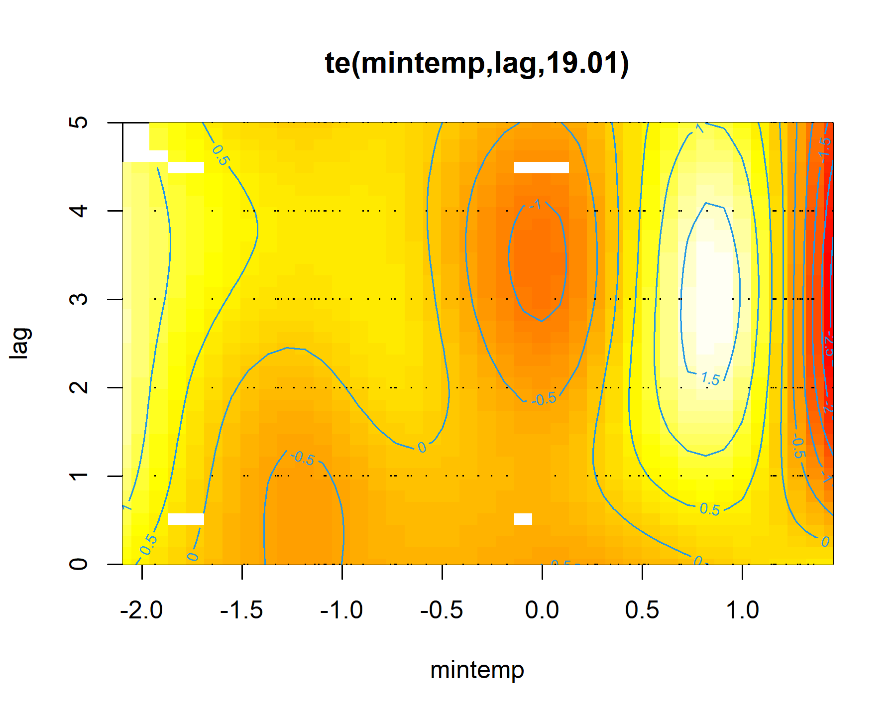
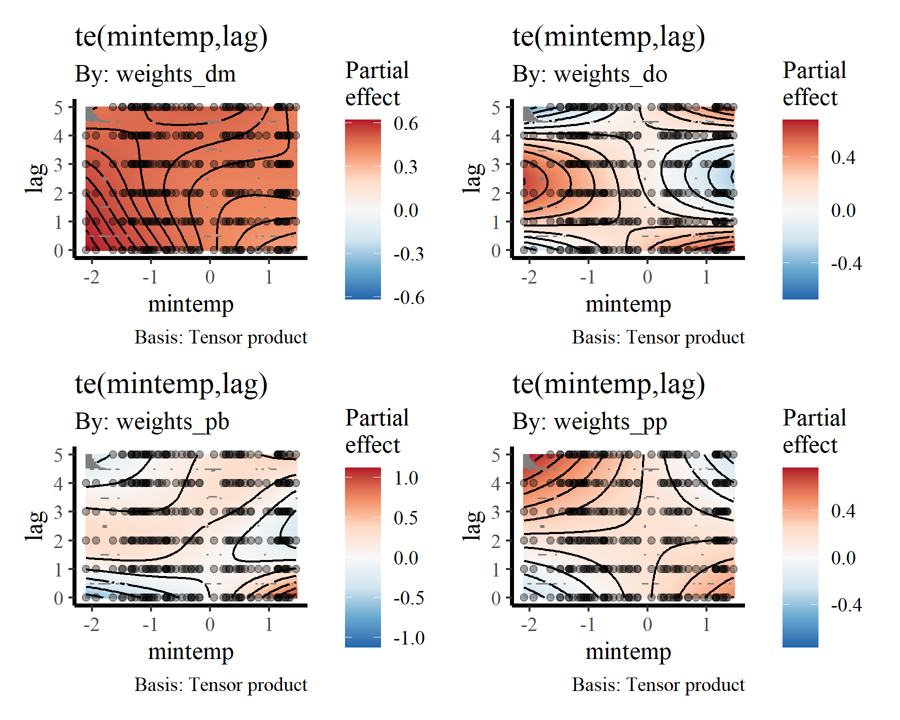
Here the brighter yellow colours indicate larger linear predictor values, while the darker red colours indicate smaller linear predictor values. We can get a nicer plot of this effect using
Gavin Simpson’s {gratia} package. Note, I am currently using the development version of this package that was recently installed from Github. This is necessary for accurate plots of nonlinear functionals that include by terms (use devtools::install_github('gavinsimpson/gratia') to get the latest version)
draw(mod1, select = 1)
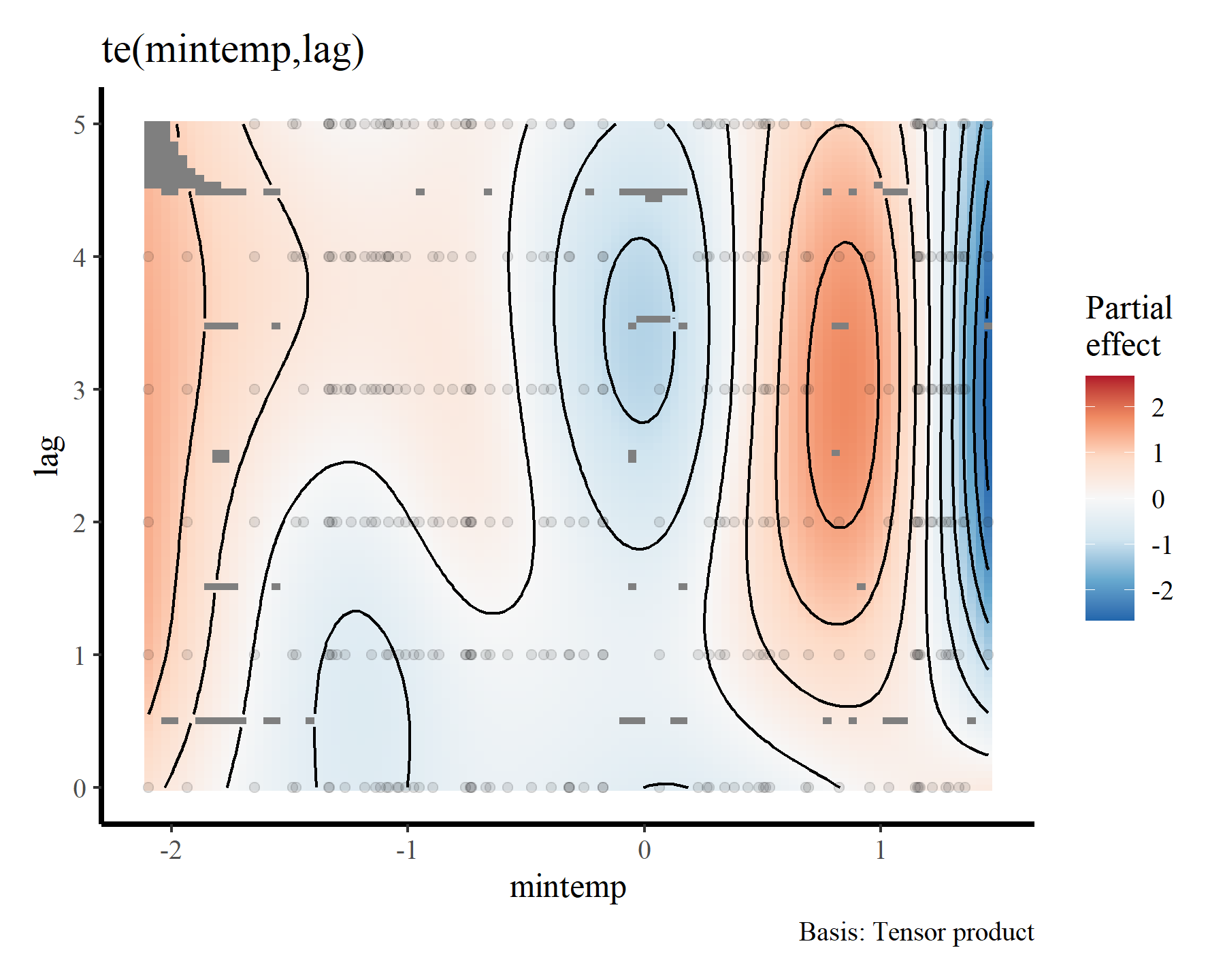
To me these bivariate heatmaps are a bit difficult to interpret, but more on that later.
Clearly there is support for a nonlinear effect of mintemp that changes over different lags, which is sensible given what we know about population dynamics in this system. But how can we incorporate such effects for all species in the model at once? The by argument in mgcv parlance can frequently be used to set up smoothers that vary across levels of a factor, and there are many extremely useful strategies for setting up hierarchical GAMs (
see this paper by Pedersen et al for some more context and many useful examples). But this option doesn’t work when we are dealing with covariates that are stored in matrix format. In fact, there was
a recent post on StackOverflow asking about this very issue:
Group-level and hierarchical distributed lags
I banged my head against the desk for several hours trying to fit hierarchical distributed lag models in {mgcv} for
a recent paper using these very data. So I know exactly how the author of this post feels. Fortunately, I discovered that they are possible. The key of course is to carefully read the {mgcv} documentation. If you look at the help for linear functionals (?mgcv::linear.functional.terms and ?mgcv::gam.models), you will see that the by variable is used in these cases as a weighting matrix. The resulting smooth is therefore constructed as rowSums(L * F), where F is the distributed lag smooth and L is the weighting matrix. After reading this (several times) I finally realised that I needed to supply group-level distributed lag terms for each group in the formula. In short, we can create weight matrices for each level of the grouping factor to set up group-level and hierarchical distributed lag terms by doing this:
weights_dm <- weights_do <- weights_pb <- weights_pp <- matrix(1, ncol = ncol(data_all$lag), nrow = nrow(data_all$lag))
What we now have is a weighting matrix for each level of the grouping factor. Currently the weights are all set to 1 for each row of the data:
head(weights_dm)
##      [,1] [,2] [,3] [,4] [,5] [,6]
## [1,]    1    1    1    1    1    1
## [2,]    1    1    1    1    1    1
## [3,]    1    1    1    1    1    1
## [4,]    1    1    1    1    1    1
## [5,]    1    1    1    1    1    1
## [6,]    1    1    1    1    1    1
But to set up the appropriate group-level tensor products, we need to change these appropriately. Essentially, for each level in the grouping factor, the rows in that level’s corresponding weighting matrix need to have 1s when the corresponding observation in the data matches that level, and 0s otherwise:
weights_dm[!(data_all$series == 'DM'), ] <- 0
weights_do[!(data_all$series == 'DO'), ] <- 0
weights_pb[!(data_all$series == 'PB'), ] <- 0
weights_pp[!(data_all$series == 'PP'), ] <- 0
Adding these weighting matrices to the data list gives us all we need to set up group-level or hierarchical distributed lag terms
data_all$weights_dm <- weights_dm
data_all$weights_do <- weights_do
data_all$weights_pb <- weights_pb
data_all$weights_pp <- weights_pp
Let’s try it out! We will fit a multispecies GAM that includes distributed lag terms of mintemp for each species. It will also smooths of ndvi_ma12 for each species, random intercepts for each species and smooths of time for each species. Again this model is probably not completely appropriate because it doesn’t take temporal autocorrelation into account very well (though the smooths of time will help), but it is useful to illustrate some of these principles
mod2 <- gam(captures ~
              # Hierarchical intercepts
              s(series, bs = 're') +

              # Smooths of time to try and capture autocorrelation
              s(time, by = series, k = 30) +

              # Smooths of ndvi_ma12
              s(ndvi_ma12, by = series, k = 5) +

              # Distributed lags of mintemp
              te(mintemp, lag, k = 4, by = weights_dm) +
              te(mintemp, lag, k = 4, by = weights_do) +
              te(mintemp, lag, k = 4, by = weights_pb) +
              te(mintemp, lag, k = 4, by = weights_pp),
            family = poisson(),
            data = data_all,
            control = list(nthreads = 6),
            method = 'REML')
summary(mod2)
##
## Family: poisson
## Link function: log
##
## Formula:
## captures ~ s(series, bs = "re") + s(time, by = series, k = 30) +
##     s(ndvi_ma12, by = series, k = 5) + te(mintemp, lag, k = 4,
##     by = weights_dm) + te(mintemp, lag, k = 4, by = weights_do) +
##     te(mintemp, lag, k = 4, by = weights_pb) + te(mintemp, lag,
##     k = 4, by = weights_pp)
##
## Parametric coefficients:
##             Estimate Std. Error z value Pr(>|z|)
## (Intercept)   0.0374     0.5223   0.072    0.943
##
## Approximate significance of smooth terms:
##                                   edf Ref.df  Chi.sq  p-value
## s(series)                  -2.847e-16  4.000   0.000 0.045616 *
## s(time):seriesDM            3.971e+00  4.827  74.186  < 2e-16 ***
## s(time):seriesDO            3.419e+00  4.173  39.097  < 2e-16 ***
## s(time):seriesPB            5.460e+00  6.497  85.988  < 2e-16 ***
## s(time):seriesPP            1.445e+01 17.310 100.348  < 2e-16 ***
## s(ndvi_ma12):seriesDM       2.803e+00  3.268  15.759 0.002060 **
## s(ndvi_ma12):seriesDO       3.268e+00  3.689  10.113 0.034299 *
## s(ndvi_ma12):seriesPB       2.580e+00  2.993   5.629 0.140632
## s(ndvi_ma12):seriesPP       1.654e+00  1.929   2.139 0.268807
## te(mintemp,lag):weights_dm  4.614e+00  5.613  41.490 1.73e-06 ***
## te(mintemp,lag):weights_do  4.135e+00  4.440  24.922 0.000106 ***
## te(mintemp,lag):weights_pb  6.848e+00  8.307  19.273 0.017449 *
## te(mintemp,lag):weights_pp  3.000e+00  3.000  25.324 1.25e-05 ***
## ---
## Signif. codes:  0 '***' 0.001 '**' 0.01 '*' 0.05 '.' 0.1 ' ' 1
##
## Rank: 196/201
## R-sq.(adj) =  0.885   Deviance explained = 89.7%
## -REML = 557.05  Scale est. = 1         n = 236
Again, useful plots of the these smooth terms can be made using {gratia}
draw(mod2, select = 2:5)
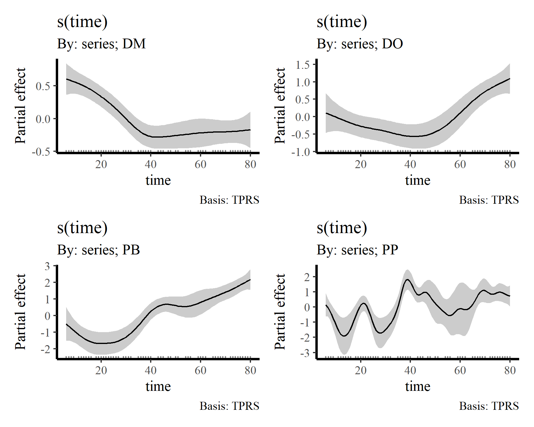
draw(mod2, select = 6:9)
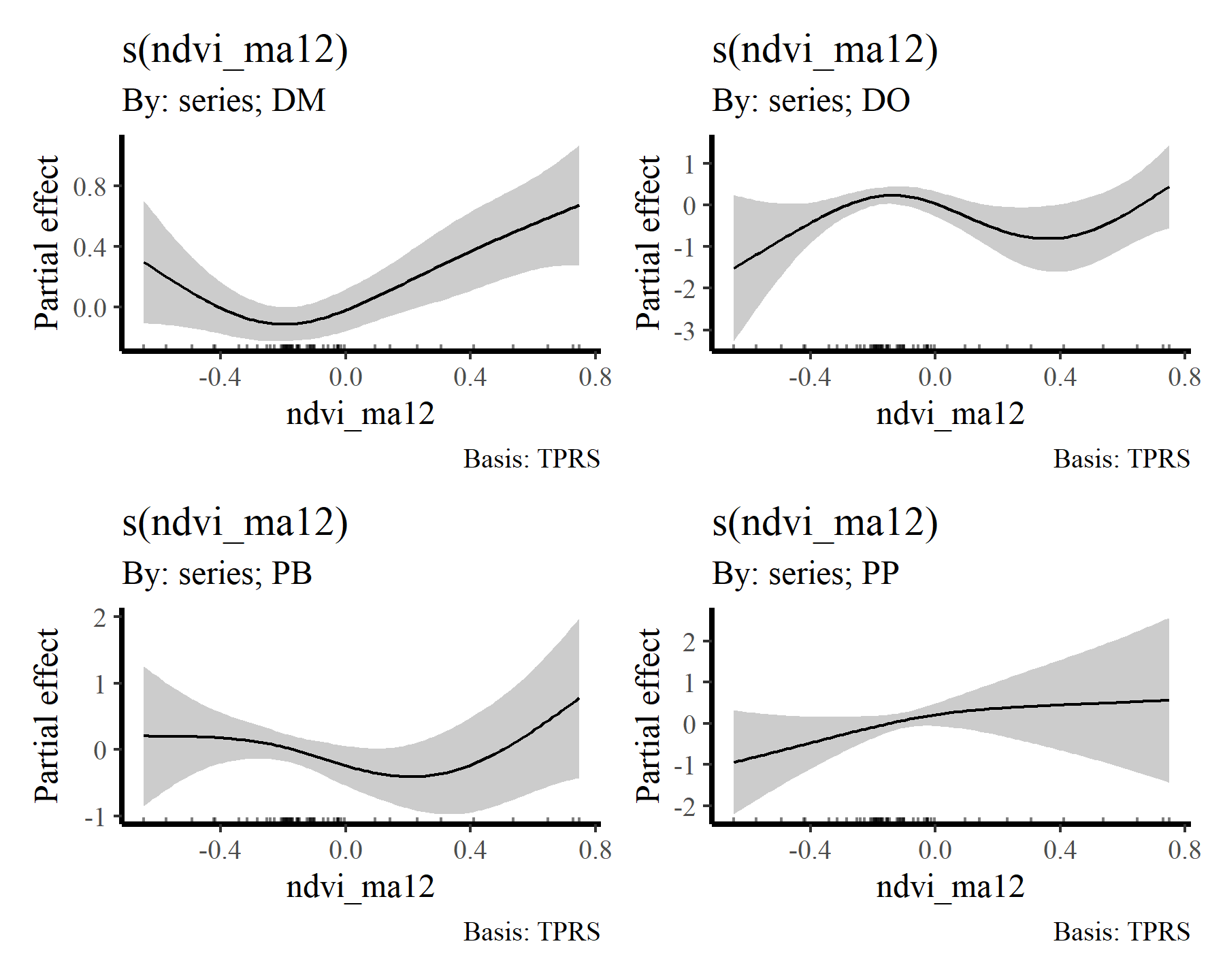
draw(mod2, select = 10:13)
Visualising distributed lag terms
If you are like me then you’ll find these bivariate heatmap plots of the distributed lag terms rather difficult to interpret. Again, the more intense yellow/white colours indicate higher predicted values, with the deeper red colours representing lower predicted values, but actually making sense of how the functional response is expected to change over different lags is not easy from these plots. However, we can use the predict.gam() function to generate much more interpretable plots. To do so, we can generate a series of conditional predictions to visualise how the estimated function of mintemp changes over different lags for each species. This is done by setting up prediction data that zeros out all covariates apart from the covariate of interest. Ordinarily I’d use the wonderful
{marginaleffects} package to automate this process, but unfortunately it doesn’t work with data that are in list format (yet). So here is a rather lengthy function that will do the work for us. It works by iterating over lags and keeping all mintemp values at zero apart from the particular lag being predicted so that we can visualise how the predicted function changes over lags of mintemp. Predictions are generated on the link scale in this case, though you could also use the response scale. Note that we need to first generate predictions with all covariates (including the mintemp covariate) zeroed out to find the ‘baseline’ prediction (which will centre around the species’ expected average count, on the log scale) so that we can shift by this baseline for generating a zero-centred plot. That way our resulting plot will roughly follow the traditional mgcv partial effect plots
plot_dist_lags = function(model, data_all){

  all_species <- levels(data_all$series)

  # Loop across species to create the effect plot dataframe
  sp_plot_dat <- do.call(rbind, lapply(all_species, function(sp){

    # Zero out all predictors to start the newdata
    newdata <- lapply(data_all, function(x){
      if(is.matrix(x)){
        matrix(0, nrow = nrow(x), ncol = ncol(x))
      } else {
        rep(0, length(x))
      }
    })

    # Modify to only focus on the species of interest
    newdata$series <- rep(sp, nrow(data_all$lag))
    newdata$lag <- data_all$lag
    which_weightmat <- grep(paste0('weights_',
                                   tolower(sp)),
                            names(newdata))
    newdata[[which_weightmat]] <- matrix(1, nrow = nrow(newdata[[which_weightmat]]),
                                         ncol = ncol(newdata[[which_weightmat]]))

    # Calculate predictions for when mintemp is zero to find the baseline
    # value for centring the plot
    if(inherits(model, 'mvgam')){
      preds <- predict(model, newdata = newdata,
                       type = 'link', process_error = FALSE)
      preds <- apply(preds, 2, median)
    } else {
      preds <- predict(model, newdata = newdata, type = 'link')
    }

    offset <- mean(preds)
    plot_dat <- do.call(rbind, lapply(seq(1:6), function(lag){
      # Set up prediction matrix for mintemp;
      # use a sequence of values across the full range of observed values
      newdata$mintemp <- matrix(0, ncol = ncol(newdata$lag),
                                nrow = nrow(newdata$lag))
      newdata$mintemp[,lag] <- seq(min(data_all$mintemp),
                                   max(data_all$mintemp),
                                   length.out = length(newdata$time))

      # Predict on the link scale and shift by the offset
      # so that values are roughly centred at zero
      if(inherits(model, 'mvgam')){
       preds <- predict(model, newdata = newdata,
                        type = 'link', process_error = FALSE)
       preds <- apply(preds, 2, median)
      } else {
       preds <- predict(model, newdata = newdata,
                        type = 'link')
      }
      preds <- preds - offset

      data.frame(lag = lag,
                 preds = preds,
                 mintemp = seq(min(data_all$mintemp),
                                   max(data_all$mintemp),
                                   length.out = length(newdata$time)))
    }))
    plot_dat$species <- sp

    plot_dat
  }))

  # Build the facetted distributed lag plot
  ggplot(data = sp_plot_dat %>%
           dplyr::mutate(lag = as.factor(lag)),
         aes(x = mintemp, y = preds,
             colour = lag, fill = lag)) +
    facet_wrap(~ species, scales = 'free') +
    geom_hline(yintercept = 0) +
    # Use geom_smooth, though beware these uncertainty
    # intervals aren't necessarily correct
    geom_smooth() +
    scale_fill_viridis(discrete = TRUE) +
    scale_colour_viridis(discrete = TRUE) +
    labs(x = 'Minimum temperature (z-scored)',
         y = 'Partial effect')

}
Plot the conditional mintemp effects for each species
plot_dist_lags(mod2, data_all)
## `geom_smooth()` using method = 'loess' and formula = 'y ~ x'
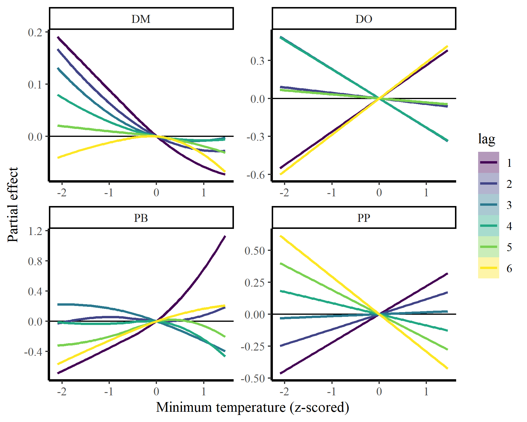
There we have it. Now it is clear that some species show fairly strong responses to cumulative change in minimum temperature, while others do not. But the fact that we aren’t effectively capturing temporal autocorrelation could be influencing these estimates. What happens if we do model temporal dynamics appropriately?
Using mvgam to capture dynamic processes
Just as a quick illustration, I will show how the same model can be used in mvgam, except that we replace the smooth functions of time with more appropriate dynamic processes that can capture the temporal autocorrelation in the observations. This model uses very similar syntax to the above and can use the same data objects, so there is no need to change much here
mod3 <- mvgam(captures ~
              # Hierarchical intercepts
              s(series, bs = 're') +

              # Smooths of ndvi_ma12
              s(ndvi_ma12, by = series, k = 6) +

              # Distributed lags of mintemp
              te(mintemp, lag, k = c(8, 5), by = weights_dm) +
              te(mintemp, lag, k = c(8, 5), by = weights_do) +
              te(mintemp, lag, k = c(8, 5), by = weights_pb) +
              te(mintemp, lag, k = c(8, 5), by = weights_pp),

              # Latent dynamic processes to capture autocorrelation
              trend_model = AR(),
            family = poisson(),
            data = data_all)
summary(mod3, include_betas = FALSE)
## GAM formula:
## captures ~ s(ndvi_ma12, by = series, k = 5) + te(mintemp, lag,
##     k = 4, by = weights_dm) + te(mintemp, lag, k = 4, by = weights_do) +
##     te(mintemp, lag, k = 4, by = weights_pb) + te(mintemp, lag,
##     k = 4, by = weights_pp) + s(series, bs = "re")
##
## Family:
## poisson
##
## Link function:
## log
##
## Trend model:
## AR()
##
## N series:
## 4
##
## N timepoints:
## 80
##
## Status:
## Fitted using Stan
## 4 chains, each with iter = 1000; warmup = 500; thin = 1
## Total post-warmup draws = 2000
##
##
## GAM coefficient (beta) estimates:
##              2.5% 50% 97.5% Rhat n_eff
## (Intercept) -0.73 1.6   3.7    1  1478
##
## GAM group-level estimates:
##                  2.5%   50% 97.5% Rhat n_eff
## mean(s(series)) -1.80 0.013   1.8 1.00  2446
## sd(s(series))    0.33 1.300   3.6 1.02   632
##
## Approximate significance of GAM smooths:
##                              edf Ref.df Chi.sq p-value
## s(ndvi_ma12):seriesDM      1.093      4   8.82     1.0
## s(ndvi_ma12):seriesDO      1.048      4   2.93     1.0
## s(ndvi_ma12):seriesPB      0.889      4   0.18     1.0
## s(ndvi_ma12):seriesPP      1.037      4   3.30     1.0
## te(mintemp,lag):weights_dm 8.649     16  11.57     1.0
## te(mintemp,lag):weights_do 5.059     16  29.12     1.0
## te(mintemp,lag):weights_pb 5.715     16  13.49     1.0
## te(mintemp,lag):weights_pp 6.973     16 144.90     1.0
## s(series)                  2.137      4  31.88     0.2
##
## Latent trend parameter AR estimates:
##           2.5%  50% 97.5% Rhat n_eff
## ar1[1]   0.760 0.95  1.00 1.04   144
## ar1[2]   0.800 0.95  1.00 1.01   404
## ar1[3]   0.850 0.96  1.00 1.00   651
## ar1[4]   0.670 0.86  0.98 1.01   693
## sigma[1] 0.075 0.14  0.24 1.07   105
## sigma[2] 0.150 0.28  0.49 1.03   111
## sigma[3] 0.270 0.47  0.72 1.02   185
## sigma[4] 0.400 0.58  0.85 1.01   329
##
## Stan MCMC diagnostics:
## n_eff / iter looks reasonable for all parameters
## Rhats above 1.05 found for 1 parameters
##  *Diagnose further to investigate why the chains have not mixed
## 9 of 2000 iterations ended with a divergence (0.45%)
##  *Try running with larger adapt_delta to remove the divergences
## 0 of 2000 iterations saturated the maximum tree depth of 12 (0%)
## Chain 1: E-FMI = 0.1879
##  *E-FMI below 0.2 indicates you may need to reparameterize your model
##
## Samples were drawn using NUTS(diag_e) at Thu Apr 04 10:37:31 AM 2024.
## For each parameter, n_eff is a crude measure of effective sample size,
## and Rhat is the potential scale reduction factor on split MCMC chains
## (at convergence, Rhat = 1)
Pay no attention to the approximate significances of these smooths, I’m still not convinced that they are being calculated correctly in {mvgam}. But notice how the AR terms are all close to 1, suggesting there is a lot of unmodelled temporal autocorrelation in the data. Has this impacted our inferences of distributed lag effects? The same prediction function can be used to visualize the distributed lag effects of mintemp:
plot_dist_lags(mod3, data_all)
## `geom_smooth()` using method = 'loess' and formula = 'y ~ x'
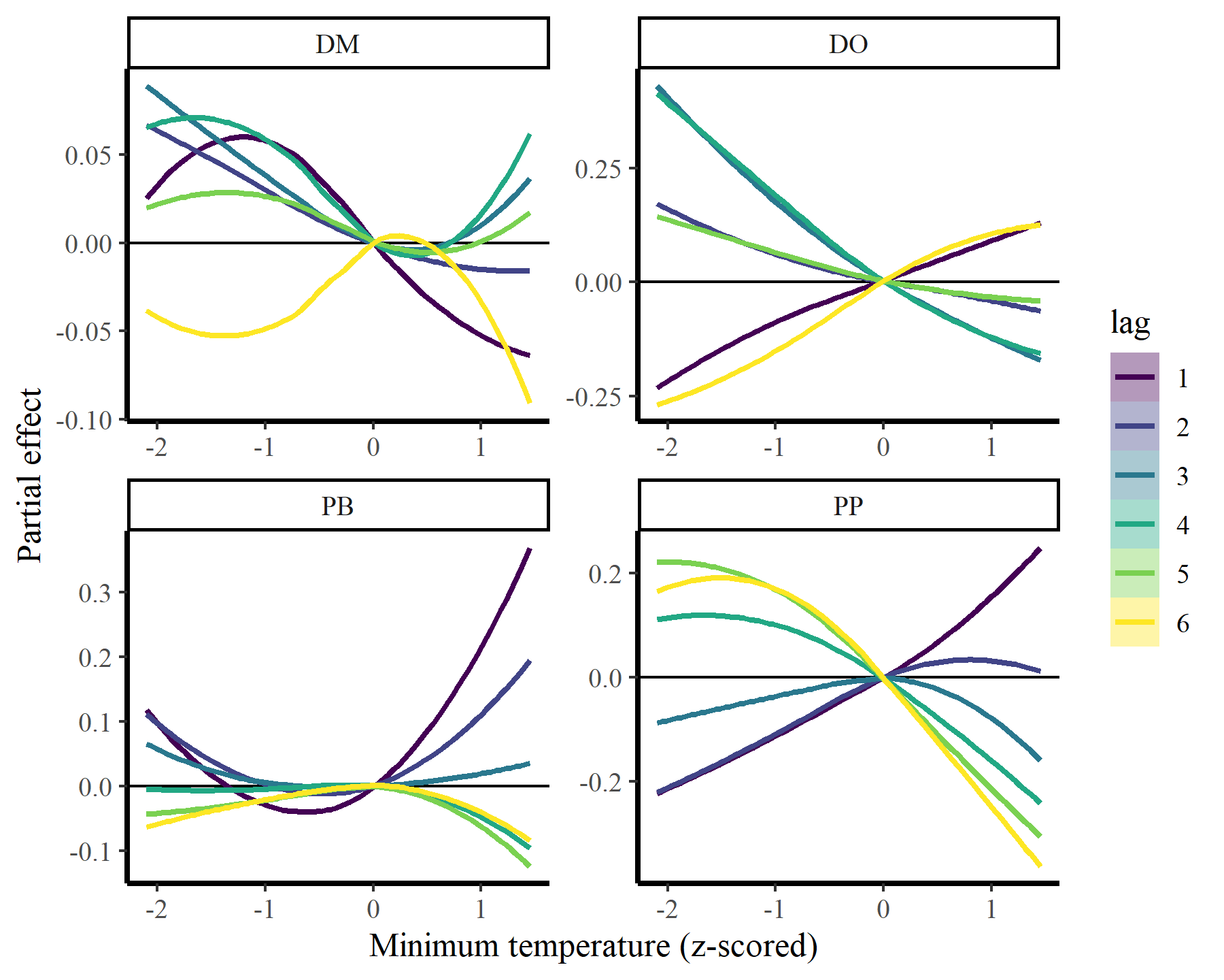
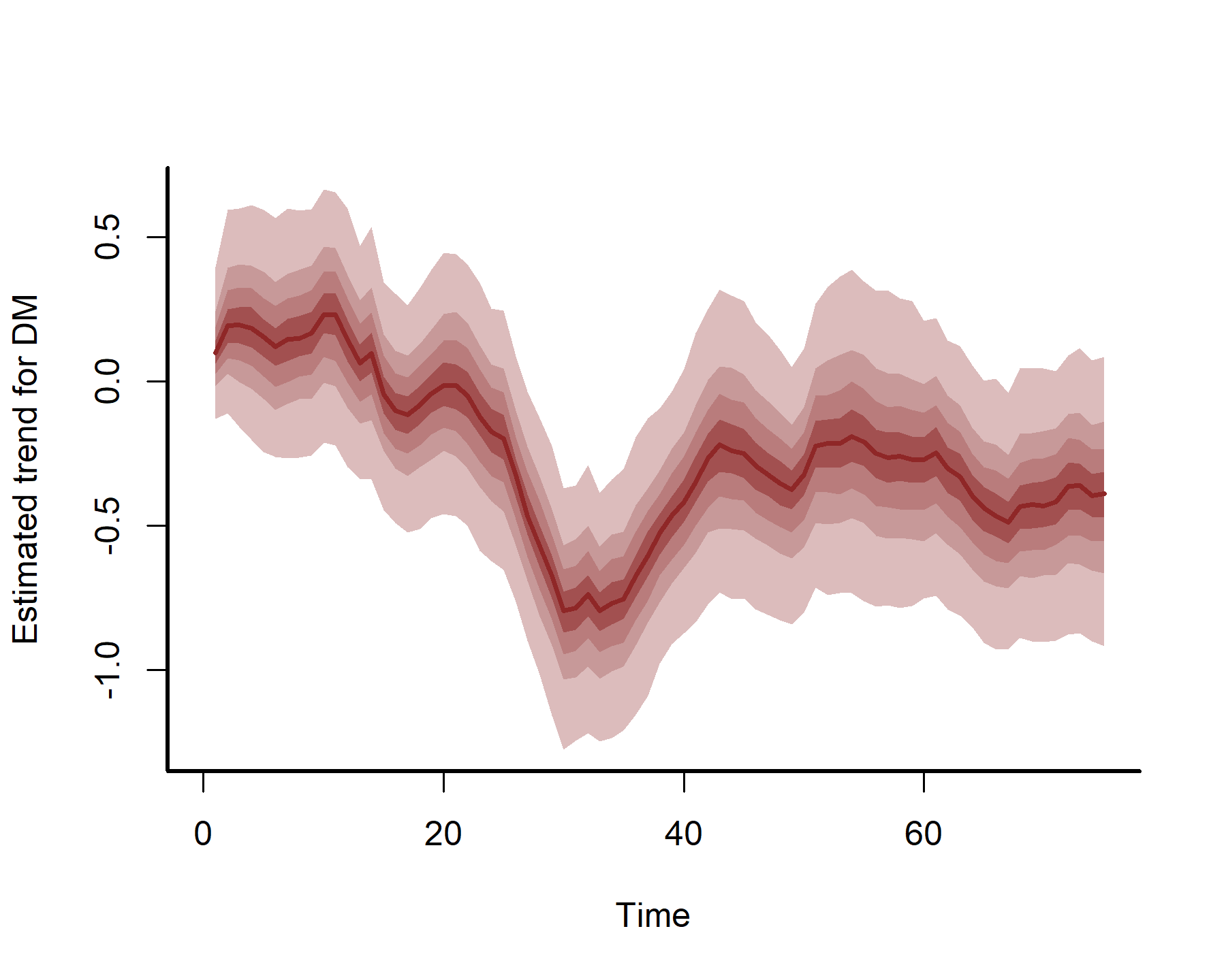
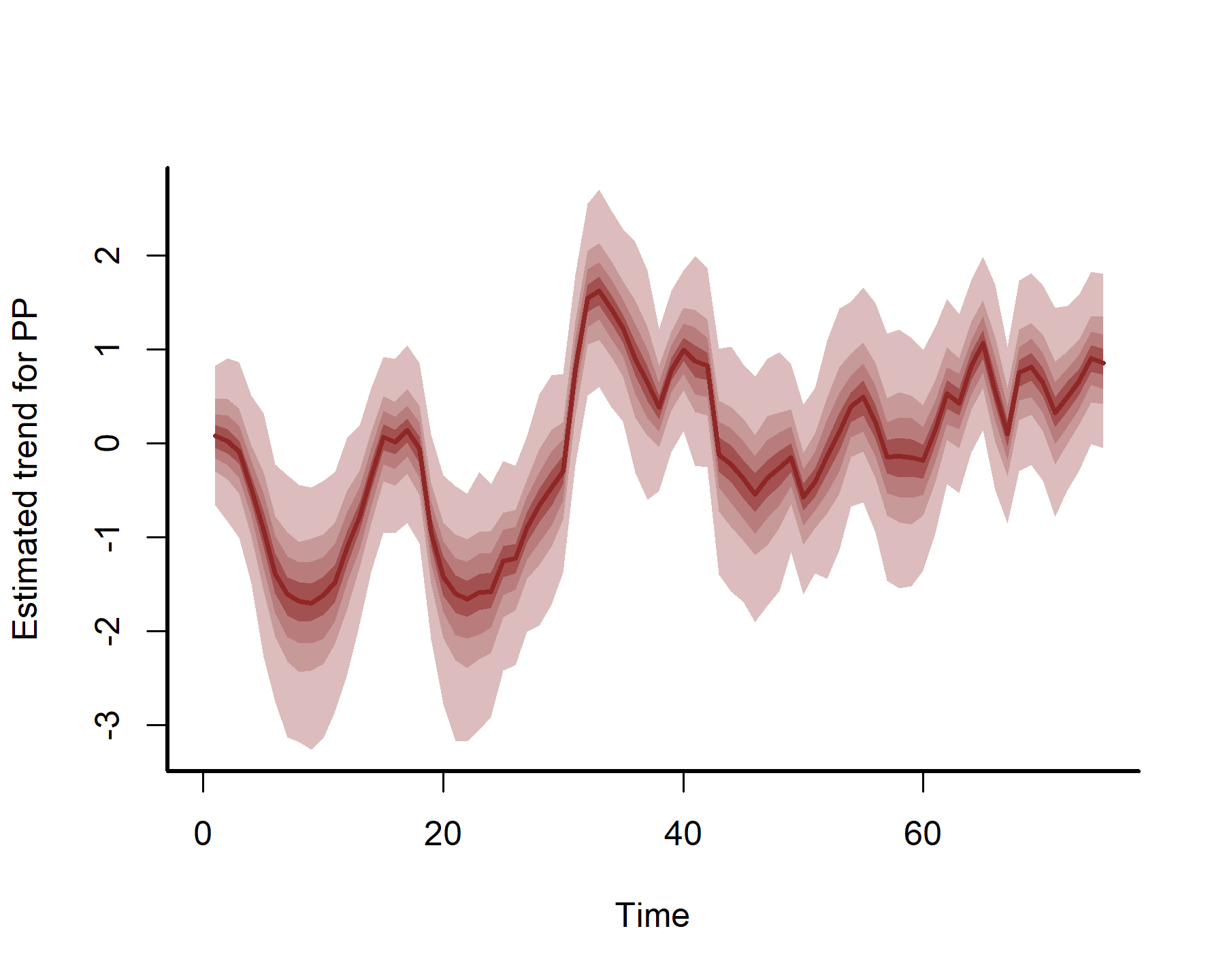
These estimates are now more nonlinear, probably because we have more power to detect effects by effectively capturing temporal dynamics with the latent AR processes:
plot(mod3, type = 'trend', series = 1)
plot(mod3, type = 'trend', series = 2)
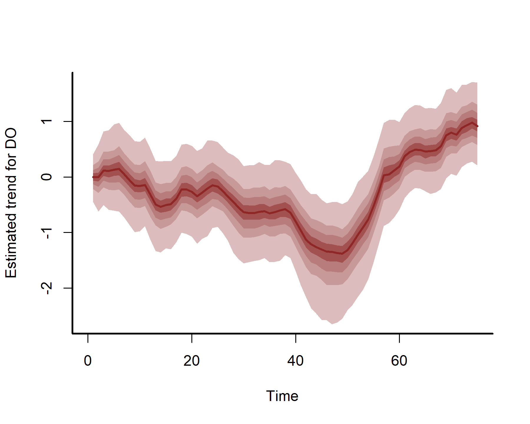
plot(mod3, type = 'trend', series = 3)
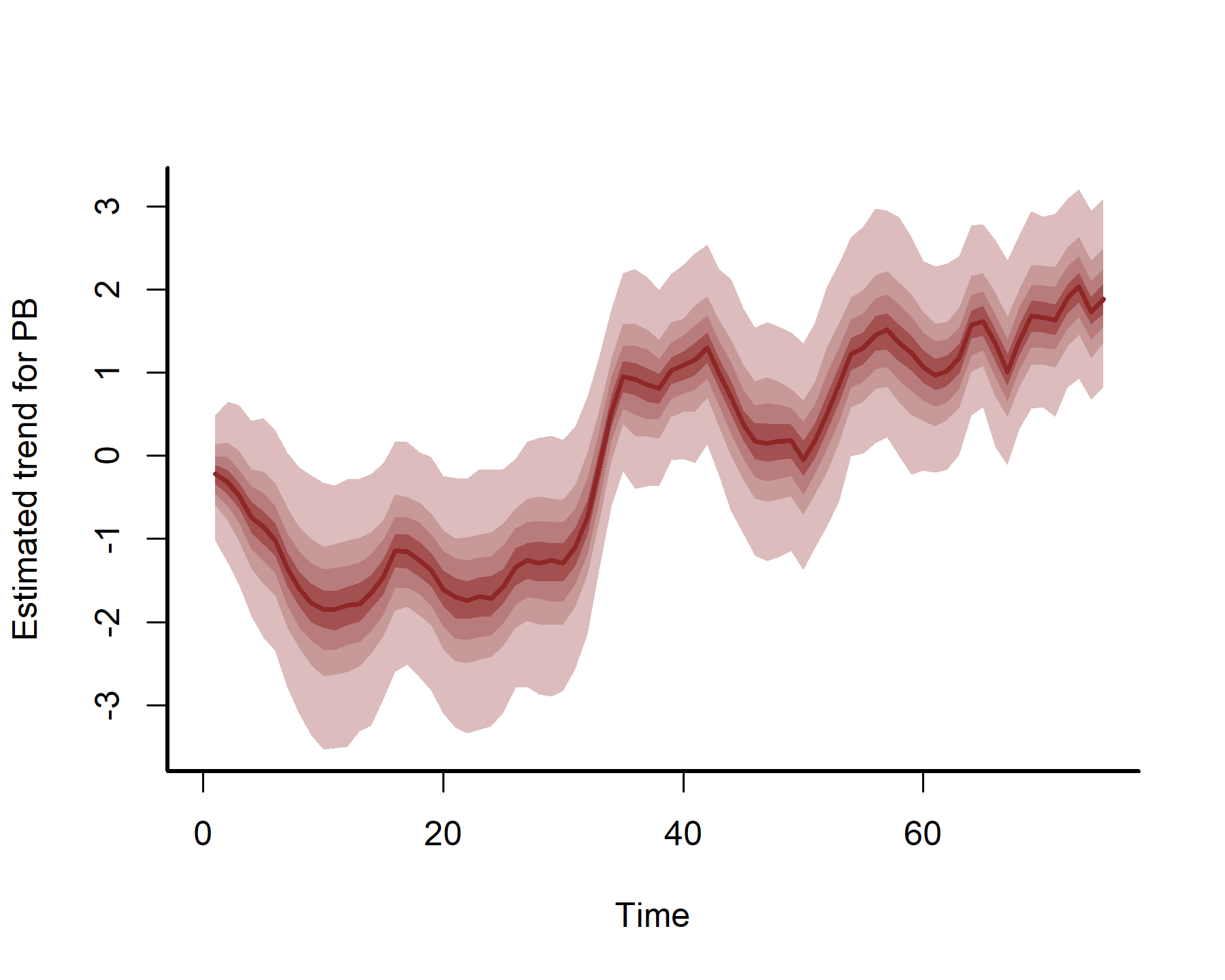
plot(mod3, type = 'trend', series = 4)
We will leave it there for this post. Hopefully you find this useful at some point!
Further reading
The following papers and resources offer useful material about Hierarchical Generalized Additive Models and distributed lag modeling
Clark, N. J., Ernest, S. K. M., Senyondo, H., Simonis, J. L., White, E. P., Yennis, G. M., & Karunarathna, K. A. N. K. (2023). Multi-species dependencies improve forecasts of population dynamics in a long-term monitoring study. Biorxiv, doi: https://doi.org/10.32942/X2TS34.
Gasparrini, A. (2014). Modeling exposure–lag–response associations with distributed lag non‐linear models. Statistics in Medicine, 33(5), 881-899.
Karunarathna, K. A. N. K., Wells, K., & Clark, N. J. (2024). Modelling nonlinear responses of a desert rodent species to environmental change with hierarchical dynamic generalized additive models. Ecological Modelling, 490, 110648.
Pedersen, E. J., Miller, D. L., Simpson, G. L., & Ross, N. (2019). Hierarchical generalized additive models in ecology: an introduction with mgcv. PeerJ, 7, e6876.