How to interpret and report nonlinear effects from Generalized Additive Models
By Nicholas Clark in rstats mgcv
May 2, 2024
What are Generalized Additive Models (GAMs)?
Generalized Additive Models (GAMs) are flexible tools that replace one or more predictors in a Generalized Linear Model (GLM) with smooth functions of predictors. These are helpful for learning arbitrarily complex, nonlinear relationships between predictors and conditional responses without needing a priori expectations about the shapes of these relationships. Rather, they are learned using penalized smoothing splines.
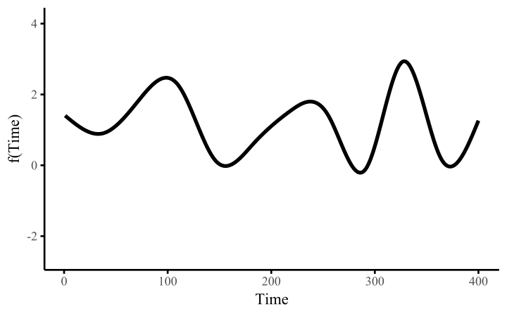
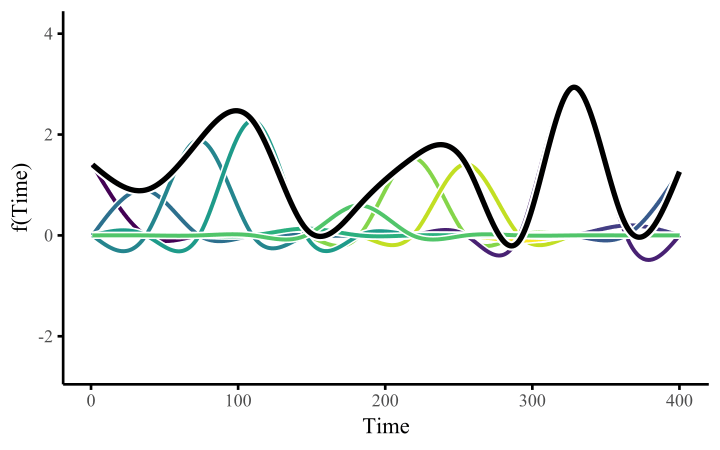
How do these work? The secret is a basis expansion, which in lay terms means that the covariate (time, in this example) is evaluated at a smaller set of basis functions designed to cover the range of the observed covariate values. Below is one particular type of basis, called a cubic regression basis.

Each basis function acts on its own local neighbourhood of the covariate. Once we have constructed the basis, we can estimate weights for each function. The weights allow the basis functions to have different impacts on the shape of the spline. They also give us a target for learning splines from data, as the weights act as the regression coefficients.
There are many more types of basis expansions that can be used to form penalized smooths, including multidimensional smooths, spatial smooths or even monotonic smooths.
When should you use a Generalized Additive Model?
GAMs are incredibly useful for several reasons. Some of these include:
- You suspect there are nonlinear relationships among your response(s) and your predictor(s)
- You have no prior knowledge about what kind of shapes these relationships might take
- You are aware that high-order polynomials can capture nonlinear effects, but you know that these are extremely unwieldy and dangerous
- You’d like to learn these shapes from your data without severe risks of overfitting
But unfortunately, GAMs are often considered difficult to interpret (at least compared to simpler linear models). For better or worse, we as scientists are often trained to look first at summary outputs from regression models and try to interpret the coefficients, their standard errors and their approximate p-values directly. I don’t agree with this practice, but it is so ingrained in tradition that it isn’t going away anytime soon. But this type of direct (dare I say, lazy?) interpretation is even more challenging when it comes to GAMs. This is because we can get summary statistics for tens or even hundreds of basis coefficients, none of which can be interpreted individually.

How do we interpret nonlinear effects from Generalized Additive Models (GAMs)?
I’ve taught several workshops on GAMs and given many more seminars, and consistently this is the most common question I receive. In this post, I illustrate the challenges of smoothing spline interpretation, and I provide 3 pointers that you can follow to start understanding, interpreting and reporting nonlinear effects from GAMs. I will make use of the widely popular
the {mgcv} R package for fitting GAMs to data. And I will show how the powerful
{marginaleffects} R package can be used to easily generate plots, summaries and hypothesis tests to help us interpret these models.
Note however that this post emphasizes how to interpret fitted nonlinear functions. I will not talk about how to address statistical significance or how to select and build models. There are many other useful resources to guide these steps, most notably the help documentation in the {mgcv} package (starting with ?mgcv::gam.models).
Environment setup and the initial GAM model
This tutorial relies on the following packages:
library(mgcv)            # Fit and interrogate GAMs
library(tidyverse)       # Tidy and flexible data manipulation
library(marginaleffects) # Compute conditional and marginal effects
library(ggplot2)         # Flexible plotting
library(patchwork)       # Combining ggplot objects
I’ll also define a custom ggplot2 theme
theme_set(theme_classic(base_size = 12, base_family = 'serif') +
            theme(axis.line.x.bottom = element_line(colour = "black",
                                                    size = 1),
                  axis.line.y.left = element_line(colour = "black",
                                                  size = 1),
                  panel.spacing = unit(0, 'lines'),
                  legend.margin = margin(0, 0, 0, -15)))
Now I load the CO2 data from the built-in datasets that are installed with R. These data contain measurements from an experiment on the cold tolerance of the grass species Echinochloa crus-galli, which you can read more about using ?CO2
data(CO2, package = "datasets")
Inspect the data structure and dimensions
dplyr::glimpse(CO2)
## Rows: 84
## Columns: 5
## $ Plant     <ord> Qn1, Qn1, Qn1, Qn1, Qn1, Qn1, Qn1, Qn2, Qn2, Qn2, Qn2, Qn2, …
## $ Type      <fct> Quebec, Quebec, Quebec, Quebec, Quebec, Quebec, Quebec, Queb…
## $ Treatment <fct> nonchilled, nonchilled, nonchilled, nonchilled, nonchilled, …
## $ conc      <dbl> 95, 175, 250, 350, 500, 675, 1000, 95, 175, 250, 350, 500, 6…
## $ uptake    <dbl> 16.0, 30.4, 34.8, 37.2, 35.3, 39.2, 39.7, 13.6, 27.3, 37.1, …
Now some manipulations for modeling
plant <- CO2 |>
  as_tibble() |>
  rename(plant = Plant, type = Type, treatment = Treatment) |>
  mutate(plant = factor(plant, ordered = FALSE))
I fit a Generalized Additive Model to these data, specifying a parametric interaction between treatment and type as well as random (hierarchical) intercepts for each plant and using Carbon Dioxide uptake (uptake) as the non-negative, real-valued response. The nonlinear part comes from a
factor smooth interaction that allows a nonlinear effect of Carbon Dioxide concentration (conc) to vary for different levels of the cold treatment variable (treatment). Given the nature of the response, a Gamma() distribution is an appropriate observation model
model_1 <- gam(uptake ~ treatment * type +
                s(plant, bs = "re") +
                s(conc, by = treatment, k = 7),
               data = plant,
               method = "REML",
               family = Gamma(link = "log"))
Look at the sumary of this model
summary(model_1)
##
## Family: Gamma
## Link function: log
##
## Formula:
## uptake ~ treatment * type + s(plant, bs = "re") + s(conc, by = treatment,
##     k = 7)
##
## Parametric coefficients:
##                                  Estimate Std. Error t value Pr(>|t|)
## (Intercept)                       3.51609    0.06376  55.143  < 2e-16 ***
## treatmentchilled                 -0.11321    0.09018  -1.255 0.213987
## typeMississippi                  -0.31196    0.09018  -3.459 0.000978 ***
## treatmentchilled:typeMississippi -0.36041    0.12753  -2.826 0.006311 **
## ---
## Signif. codes:  0 '***' 0.001 '**' 0.01 '*' 0.05 '.' 0.1 ' ' 1
##
## Approximate significance of smooth terms:
##                               edf Ref.df      F p-value
## s(plant)                    7.032   8.00  8.022  <2e-16 ***
## s(conc):treatmentnonchilled 5.193   5.68 83.888  <2e-16 ***
## s(conc):treatmentchilled    5.013   5.55 58.970  <2e-16 ***
## ---
## Signif. codes:  0 '***' 0.001 '**' 0.01 '*' 0.05 '.' 0.1 ' ' 1
##
## R-sq.(adj) =  0.957   Deviance explained = 95.5%
## -REML = 239.08  Scale est. = 0.010327  n = 84
There seem to be lots of “significant” effects here, but how on Earth do we interpret these smooth terms? The summary gives no indication of the magnitude, direction or overall shape of these smooth effects. Nor do the coefficients, for that matter:
coef(model_1)
##                      (Intercept)                 treatmentchilled
##                      3.516091294                     -0.113205794
##                  typeMississippi treatmentchilled:typeMississippi
##                     -0.311956077                     -0.360409395
##                       s(plant).1                       s(plant).2
##                     -0.041226486                     -0.015294663
##                       s(plant).3                       s(plant).4
##                      0.056521148                     -0.040103411
##                       s(plant).5                       s(plant).6
##                      0.026931174                      0.013172237
##                       s(plant).7                       s(plant).8
##                     -0.055925539                      0.049887951
##                       s(plant).9                      s(plant).10
##                      0.006037588                     -0.215582180
##                      s(plant).11                      s(plant).12
##                      0.097118479                      0.118463702
##    s(conc):treatmentnonchilled.1    s(conc):treatmentnonchilled.2
##                      5.232322869                      1.133239546
##    s(conc):treatmentnonchilled.3    s(conc):treatmentnonchilled.4
##                     -1.904830565                      0.129187847
##    s(conc):treatmentnonchilled.5    s(conc):treatmentnonchilled.6
##                      0.236060128                      1.202602610
##       s(conc):treatmentchilled.1       s(conc):treatmentchilled.2
##                      3.690591324                      2.117499952
##       s(conc):treatmentchilled.3       s(conc):treatmentchilled.4
##                     -2.367697749                      0.063467378
##       s(conc):treatmentchilled.5       s(conc):treatmentchilled.6
##                      0.236541597                      0.967747793
The coefficients labelled s(conc):treatmentnonchilled and s(conc):treatmentchilled are the basis function weights that control the shape of these splines. But without having a full understanding of what these basis functions look like and how they act collectively to form the spline, we are fairly lost for interpretation.
Now I will walk through 3 steps that you can use to help with interpreting and reporting nonlinear effects from GAMs. These steps are by no means exhaustive, but given the
Step 1: Vizualising GAM outputs
Visuals are by-far our best go-to tool for understanding GAMs. This is why the {mgcv} package has some simple but powerful plotting routines that we can apply directly to fitted gam objects. See ?mgcv::plot.gam for more details about default plotting.
Plotting GAM effects on the link scale
The most common visualisattion that users make when working with GAMs are
partial effects plots on the link scale. Basically, these plots show the individual component effect of a smooth function on the link scale, conditional on all other terms in the model being set to zero. Because most smooth terms in {mgcv} are zero-centred to maintain identifiability, they are convenient to look at because we can immediately make some interpretations. For example, we can see the partial effect of the conc smooth for the nonchilled treatment by selecting the second smooth term in the model:
plot(model_1, select = 2, shade = TRUE)
abline(h = 0, lty = 'dashed')
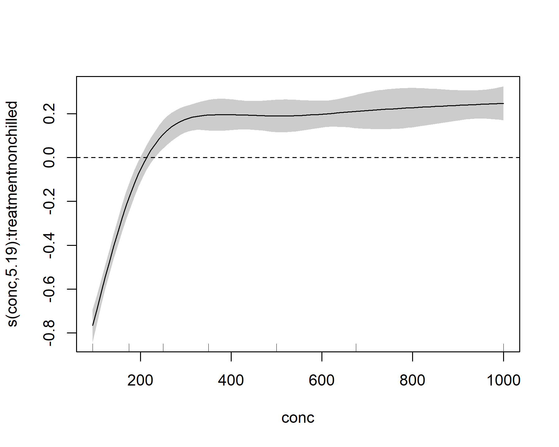
This plot shows that, for the nonchilled treatment, the effect of conc on the linear predictor is mostly negative (below zero) for small values of conc, but it quickly becomes positive (above zero) for intermediate values of conc. It then begins to plateau at larger values of conc. We can also look at the effect for the other level of treatment
plot(model_1, select = 3, shade = TRUE)
abline(h = 0, lty = 'dashed')
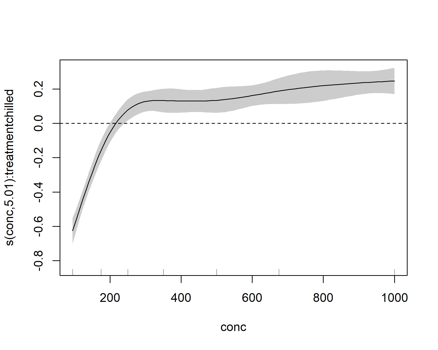
This plot looks broadly similar, but it is not identical to the nonchilled treatment effect.
These plots are a good first step to interrogate GAMs, but they have several limitations:
- They only show what the model expects to see if all other terms are dropped. These are not helpful if we want to aggregate over multiple smooths (i.e. What is the average smooth effect of
conc?) or in situations where covariates occur in multiple terms. For example, a formula such as:y ~ s(rain) + s(temp) + s(year) + ti(rain, temp) + ti(rain, year) + ti(temp, year)is perfectly allowed ingam()(and very useful in many contexts). But the effects of our predictors of interest are spread across multiple smooth functions and we cannot interpret these individually - These plots are shown on the link scale, which can often translate nonlinearly into effects on the scale of interest (the response scale. For example we have a log link function in this
Gamma()observation model, so the partial effects are not the same as what we’d expect on the actual scale ofuptake - We cannot ask more targeted questions using these plots, such as How does the effect of
concdiffer among treatment groups? or How much more uptake would we expect ifconcincreased from 150 to 300 mL/L?
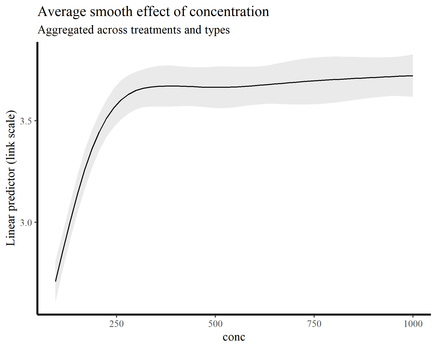
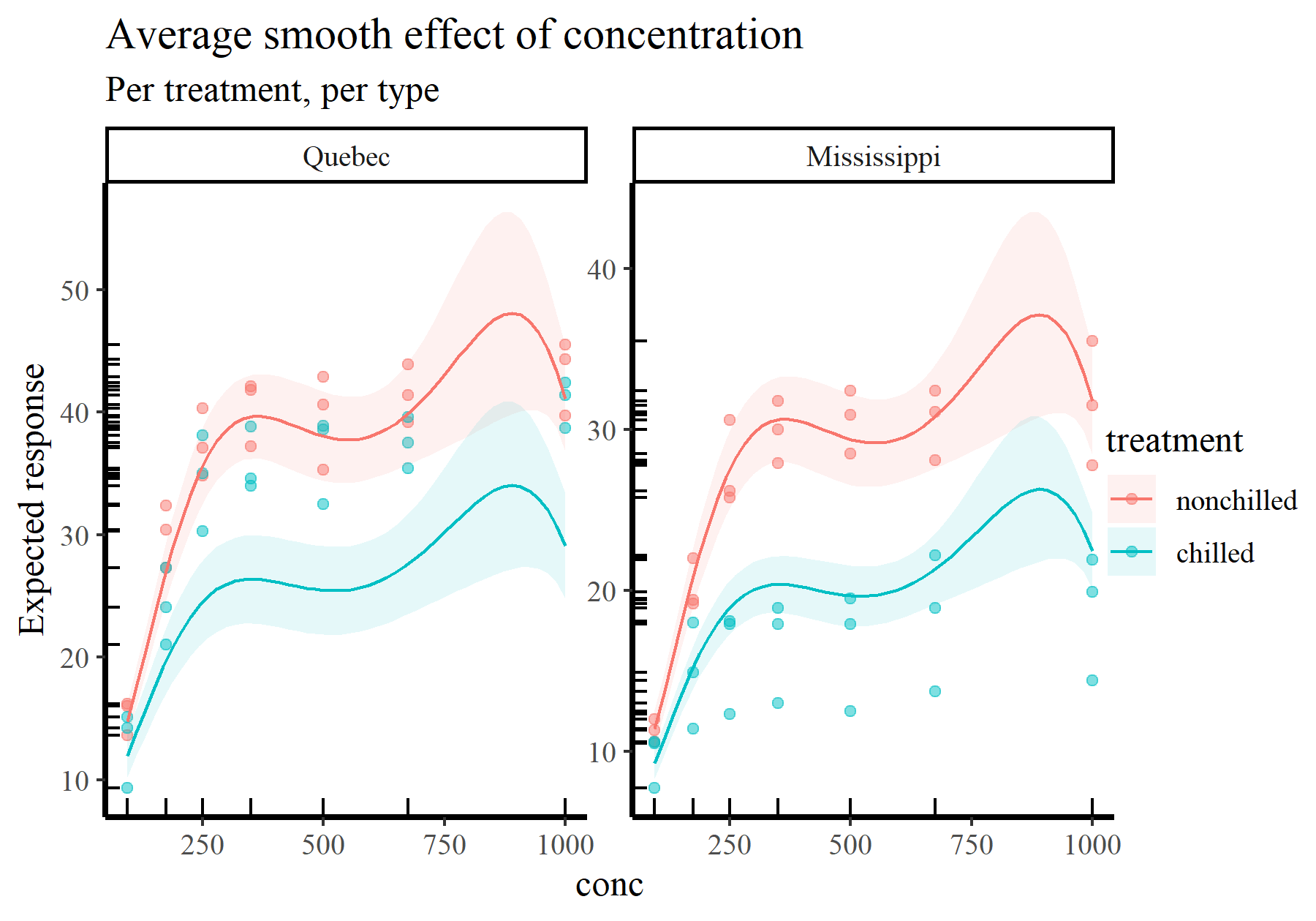
For the remainder of this post, I’ll switch over to making plots and summaries using the elegant {marginaleffects} package. It turns out that the functions available in this package make answering all of the above questions easy and seamless. Moreover, we could easily fit different kinds of models (i.e. GLMs, location-scale models, survival models etc…) to these same data and use the exact same functions for making model comparisons. To begin illustrating, I’ll tackle the first point above by computing and plotting the average smooth effect of conc across all treatment levels. Again this plot is made on the link scale, but it is no longer zero-centred because the intercepts are taken into account
plot_predictions(model_1, condition = 'conc',
                 type = 'link') +
  labs(y = "Linear predictor (link scale)",
       title = "Average smooth effect of concentration",
       subtitle = "Aggregated across treatments and types")
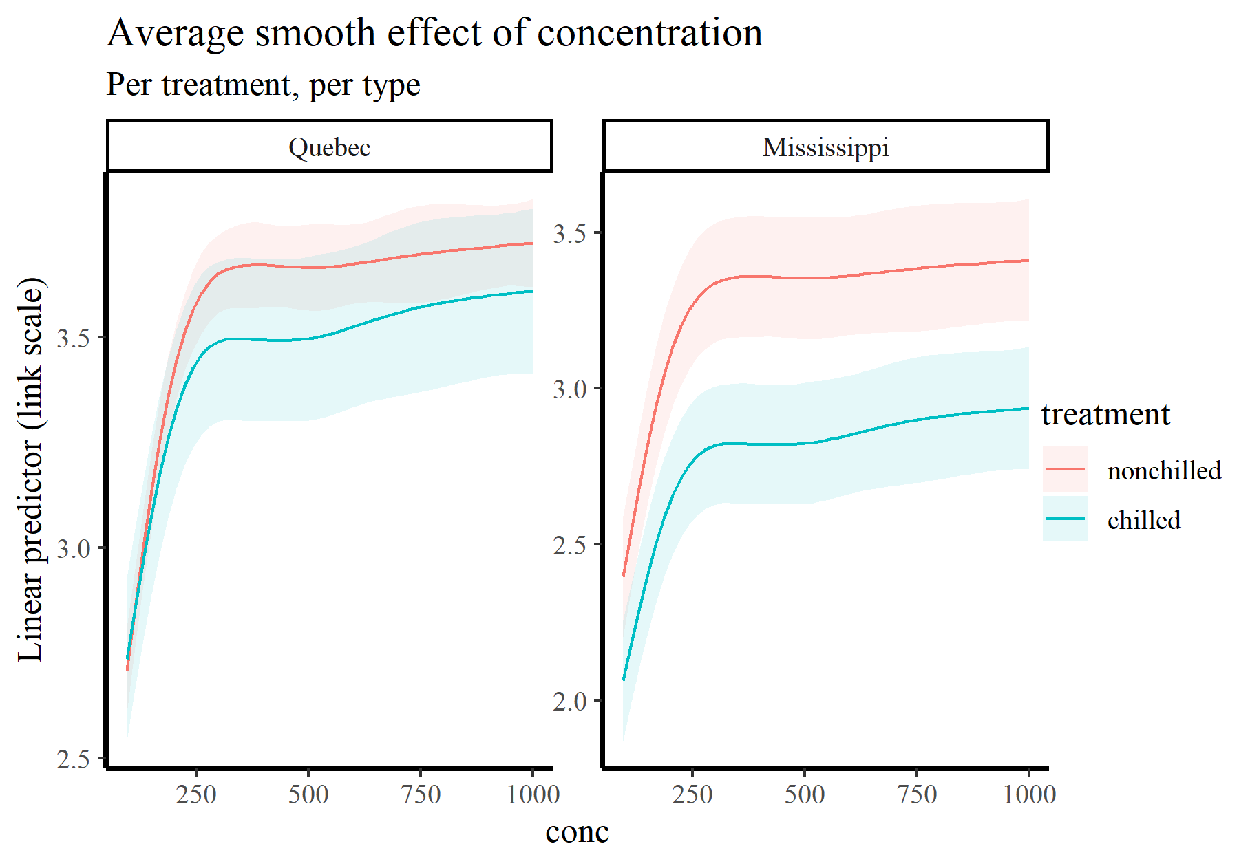
Of course we can very readily split these plots by treatment and type:
plot_predictions(model_1, condition = c('conc', 'treatment', 'type'),
                 type = 'link') +
      labs(y = "Linear predictor (link scale)",
           title = "Average smooth effect of concentration",
           subtitle = "Per treatment, per type")
There are many more possibilities for making simple, one-line-of-code targeted plots using plot_predictions(). See ?marginaleffects::plot_predictions for guidance. But we can do much more than plot conditional predictions using this framework. For example,
we often want to understand how the slope of a fitted function changes across the range of a covariate. We can calculate the slopes (i.e. the first derivatives) of our smooth functions using the plot_slopes() function, which conveniently has very similar arguments and structure to plot_predictions():
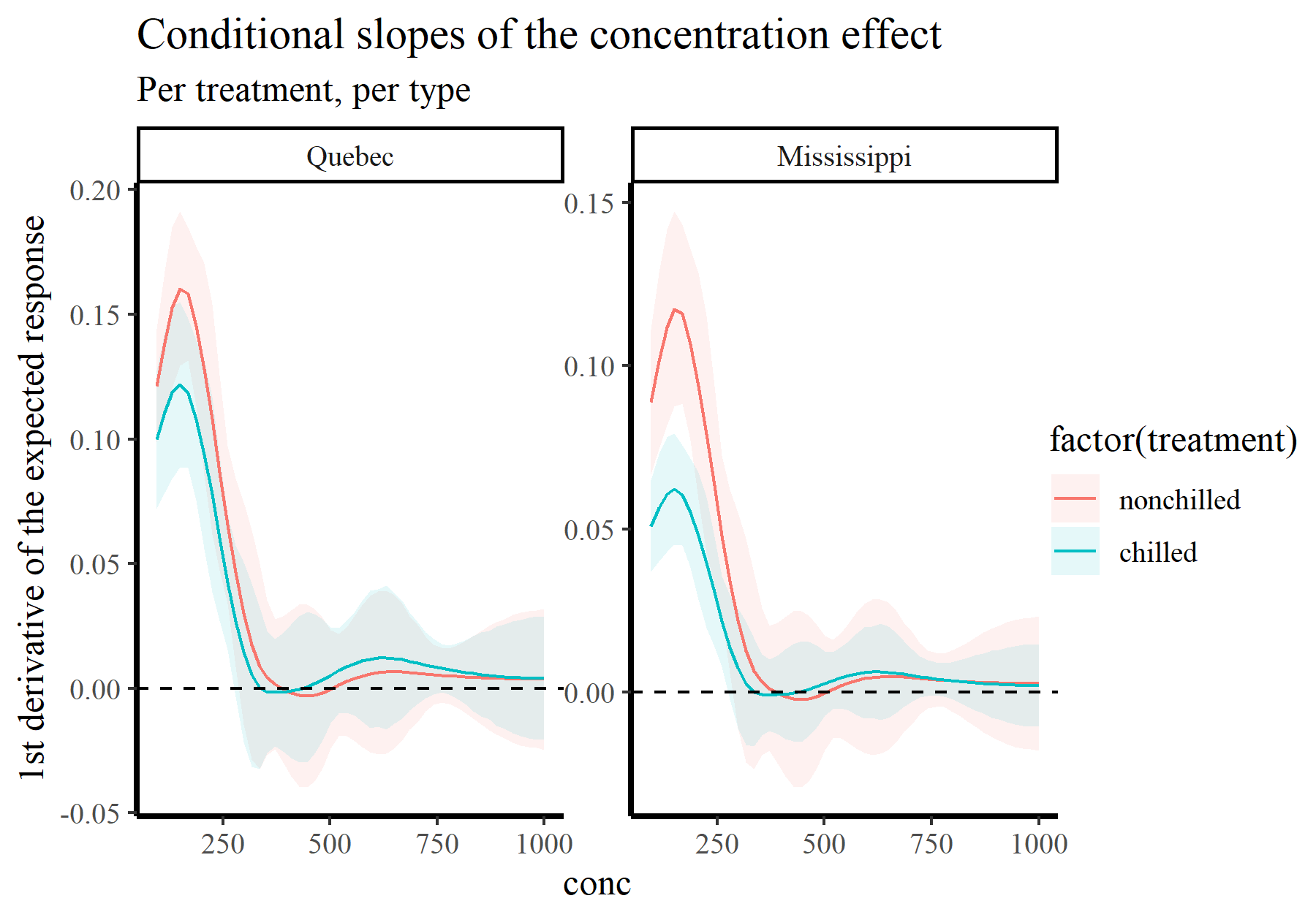
plot_slopes(model_1, variables = 'conc',
            condition = c('conc', 'treatment'),
            type = 'link') +
  geom_hline(yintercept = 0, linetype = 'dashed') +
  labs(y = "1st derivative of the linear predictor",
       title = "Conditional slopes of the concentration effect",
       subtitle = "Per treatment, per type")
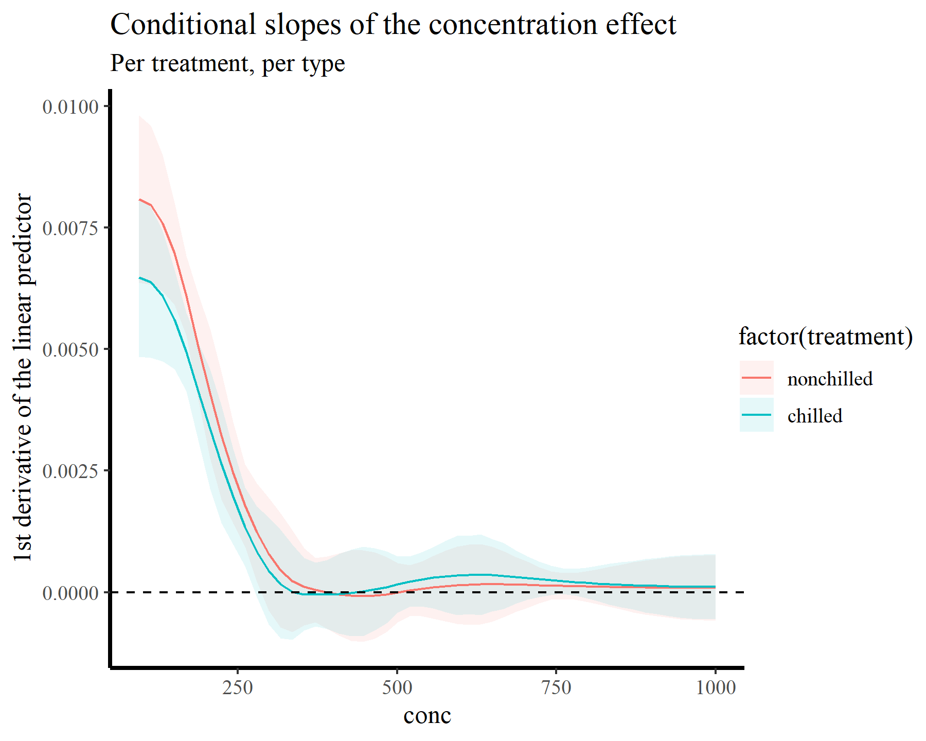
This plot makes it more clear that the slope is positive up until we hit conc values near 260, beyond which the function plateaus. Now we will tackle the second point above, which relates to probably the second-most common question users ask when working with GAMs in {mgcv}:
How do I plot smooth effects on the outcome scale?
Plotting GAM effects on the response scale
In fact this is dead-simple with {marginaleffects}. We just change type = 'response' and away we go! Of course we now have options to show the observed values on these plots, which is something we might often want to do
plot_predictions(model_1, condition = 'conc',
                 type = 'response', points = 0.5,
                 rug = TRUE) +
  labs(y = "Expected response",
       title = "Average smooth effect of concentration",
       subtitle = "Aggregated across treatments and types")
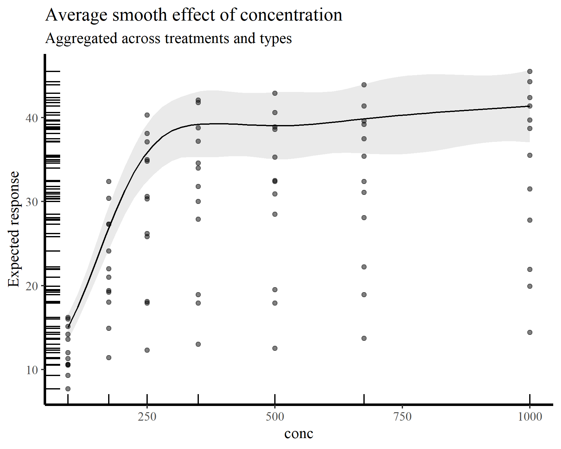
Here is the average smooth of conc once again, but this time on the scale of the response variable. The points and rugs show observed values, which makes it clear that a single effect of conc would not be enough to capture the heterogeneity in the data. Splitting by treatment and type again makes things more clear
plot_predictions(model_1, condition = c('conc', 'treatment', 'type'),
                 type = 'response', points = 0.5,
                 rug = TRUE) +
      labs(y = "Expected response",
           title = "Average smooth effect of concentration",
           subtitle = "Per treatment, per type")
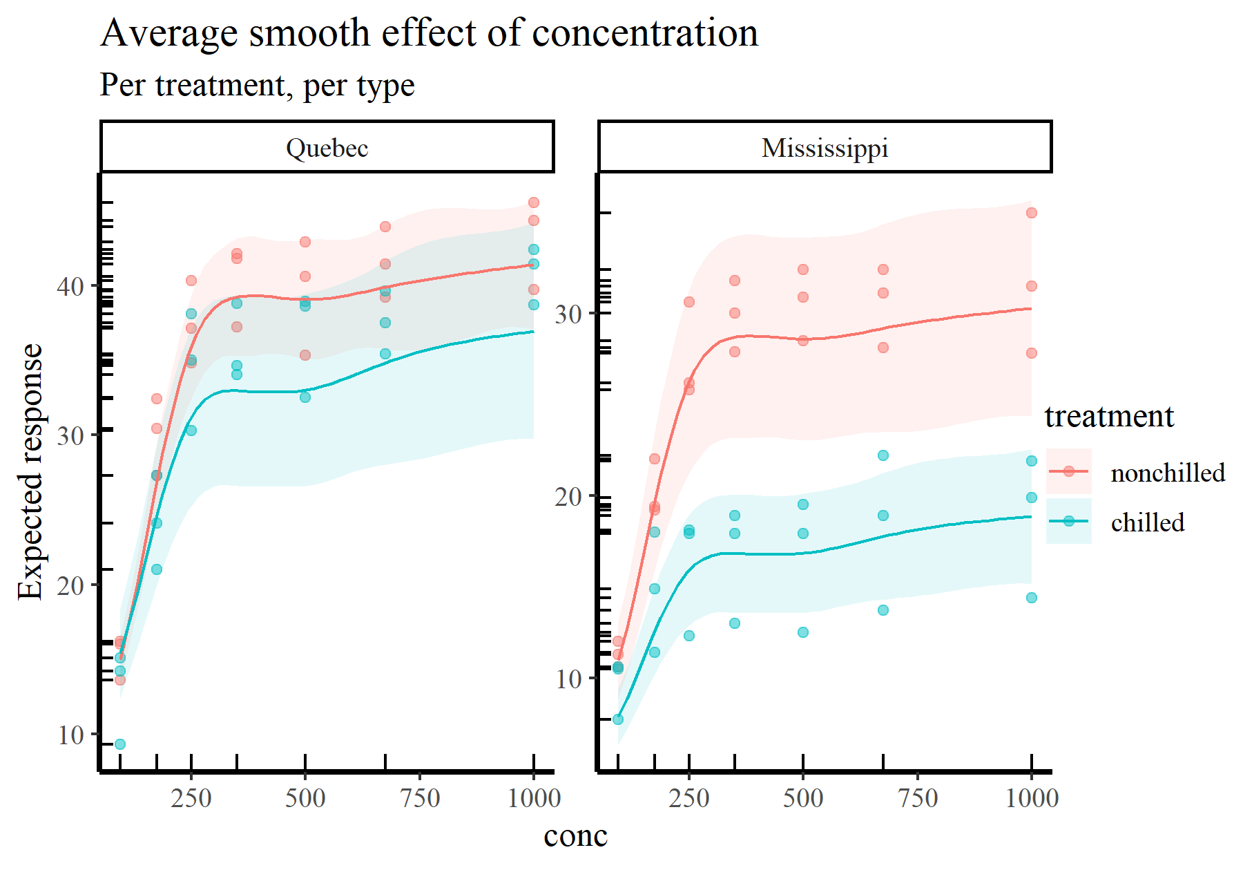
These types of plots give us more ability to interrogate and criticize our fitted models. Some questions you can start to ask when trying to interpret or report functions from GAMs include:
- Does the function reach an aysmptote anywhere over its range?
- Is the function highly wiggly, or does it appear smooth?
- Does the function appear to have multiple modes, and does this make sense?
- Are there large regions over which you have few data points, and does the function’s uncertainty grow appropriately?
- Are there any points that look like outliers, which the function may be responding strongly to?
And in case you were wondering, yes you can also plot slopes on the scale of the response:
plot_slopes(model_1, variables = 'conc',
            condition = c('conc', 'treatment', 'type'),
            type = 'response') +
  geom_hline(yintercept = 0, linetype = 'dashed') +
  labs(y = "1st derivative of the expected response",
       title = "Conditional slopes of the concentration effect",
       subtitle = "Per treatment, per type")
By now you may be wondering where these predictions are coming from. This brings me to the next tool in your arsenal for interpreting GAMs, simulation
Step 2: Simulating from fitted GAM models
In a related blog post, I show how simulating data in R can be essential to understand models and their limitations. This is especially applicable to GAMs because this simulation involves producing the linear predictor (i.e. design) matrix. This matrix is what we get when our covariates are evaluated at their respective basis functions.
Using type = 'lpmatrix' to understand what coefficients mean in a GAM model
Generating the linear predictor matrix, which I’ll refer to as \(X_{lp}\), is simple in {mgcv}. We just use predict.gam() and set type = 'lpmatrix'. This can be done for new data or for the original data that were used to fit the model. Here is the latter:
Xp <- predict(model_1, type = 'lpmatrix')
dim(Xp)
## [1] 84 28
You can see there are 84 rows in the matrix, corresponding to the 84 observations in our data. But we have 28 columns, many of which represent the basis functions for the two smooth terms in the model
colnames(Xp)
##  [1] "(Intercept)"                      "treatmentchilled"
##  [3] "typeMississippi"                  "treatmentchilled:typeMississippi"
##  [5] "s(plant).1"                       "s(plant).2"
##  [7] "s(plant).3"                       "s(plant).4"
##  [9] "s(plant).5"                       "s(plant).6"
## [11] "s(plant).7"                       "s(plant).8"
## [13] "s(plant).9"                       "s(plant).10"
## [15] "s(plant).11"                      "s(plant).12"
## [17] "s(conc):treatmentnonchilled.1"    "s(conc):treatmentnonchilled.2"
## [19] "s(conc):treatmentnonchilled.3"    "s(conc):treatmentnonchilled.4"
## [21] "s(conc):treatmentnonchilled.5"    "s(conc):treatmentnonchilled.6"
## [23] "s(conc):treatmentchilled.1"       "s(conc):treatmentchilled.2"
## [25] "s(conc):treatmentchilled.3"       "s(conc):treatmentchilled.4"
## [27] "s(conc):treatmentchilled.5"       "s(conc):treatmentchilled.6"
These correspond to the coefficients, \(\beta\), that we extracted earlier from the fitted model
beta <- coef(model_1)
all.equal(names(beta), colnames(Xp))
## [1] TRUE
If we use linear algebra to cross-multiply these coefficients with the design matrix \((X_{lp}\beta)\) we get the predicted values on the link scale:
preds <- as.vector(Xp %*% beta)
Running these through the inverse link function (which is exp() in the case of our log link) gives us the fitted values from the model
all.equal(fitted(model_1), exp(preds))
## [1] TRUE
As with the examples
in my other blog post about simulation in R, you can investigate uncertainties in these predictions by drawing \(\beta\) coefficients from the model’s implied multivariate normal posterior distribution. But I won’t cover that again here.
This is all well and good, but it becomes much more useful when we supply new data to the predict.gam() function. For example, what might we predict if we had a new measurement for plant Qn1 measured on treatment = nonchilled in type = Mississippi and with CO2 concentration conc = 278? This could be a targeted scenario that we are interested in:
newXp <- predict(model_1, type = 'lpmatrix',
                 newdata = data.frame(plant = 'Qn1',
                                      treatment = 'nonchilled',
                                      type = 'Mississippi',
                                      conc = 278))
dim(newXp)
## [1] 1 28
Here we have taken our relatively simple scenario and run it through all necessary basis evaluations to produce the design matrix. Generating expected uptake from this scenario is then as simple as:
exp(newXp %*% beta)
##       [,1]
## 1 27.56059
It might be difficult to appreciate the power of this approach, but the possibilities to explore targeted scenarios are endless once you master these steps. For example, we can use these steps to see what the underlying basis functions for the effect of conc look like. Simply simulate a sequence of fake conc values to cover the range of the covariate and run those through the predict.gam() function (keeping the other covariates fixed to particular values):
conc_seq <- seq(from = min(plant$conc), max(plant$conc), length.out = 500)
newdat <- data.frame(conc = conc_seq,
                     plant = 'Qn1',
                     treatment = 'nonchilled',
                     type = 'Mississippi')
newXp <- predict(model_1, type = 'lpmatrix', newdata = newdat)
Find which coefficients belong to the first smooth of conc
conc_coefs <- model_1$smooth[[2]]$first.para:model_1$smooth[[2]]$last.para
conc_coefs
## [1] 17 18 19 20 21 22
And now set all cells in the \(X_{lp}\) matrix that don’t correspond to these coefficients to zero
newXp_adj <- matrix(0, ncol = NCOL(newXp), nrow = NROW(newXp))
newXp_adj[,conc_coefs] <- newXp[, conc_coefs]
Generate the predictions on the link scale and plot the functions
plot_dat = do.call(rbind, lapply(seq_along(conc_coefs), function(basis){
  data.frame(basis_func = paste0('bs', basis),
             conc = conc_seq,
             value = newXp_adj[, conc_coefs[basis]] * beta[conc_coefs[basis]])
}))

ggplot(plot_dat, aes(x = conc, y = value, col = basis_func)) +
  geom_line(linewidth = 0.75) + theme(legend.position = 'none') +
  labs(y = 'Basis function value')
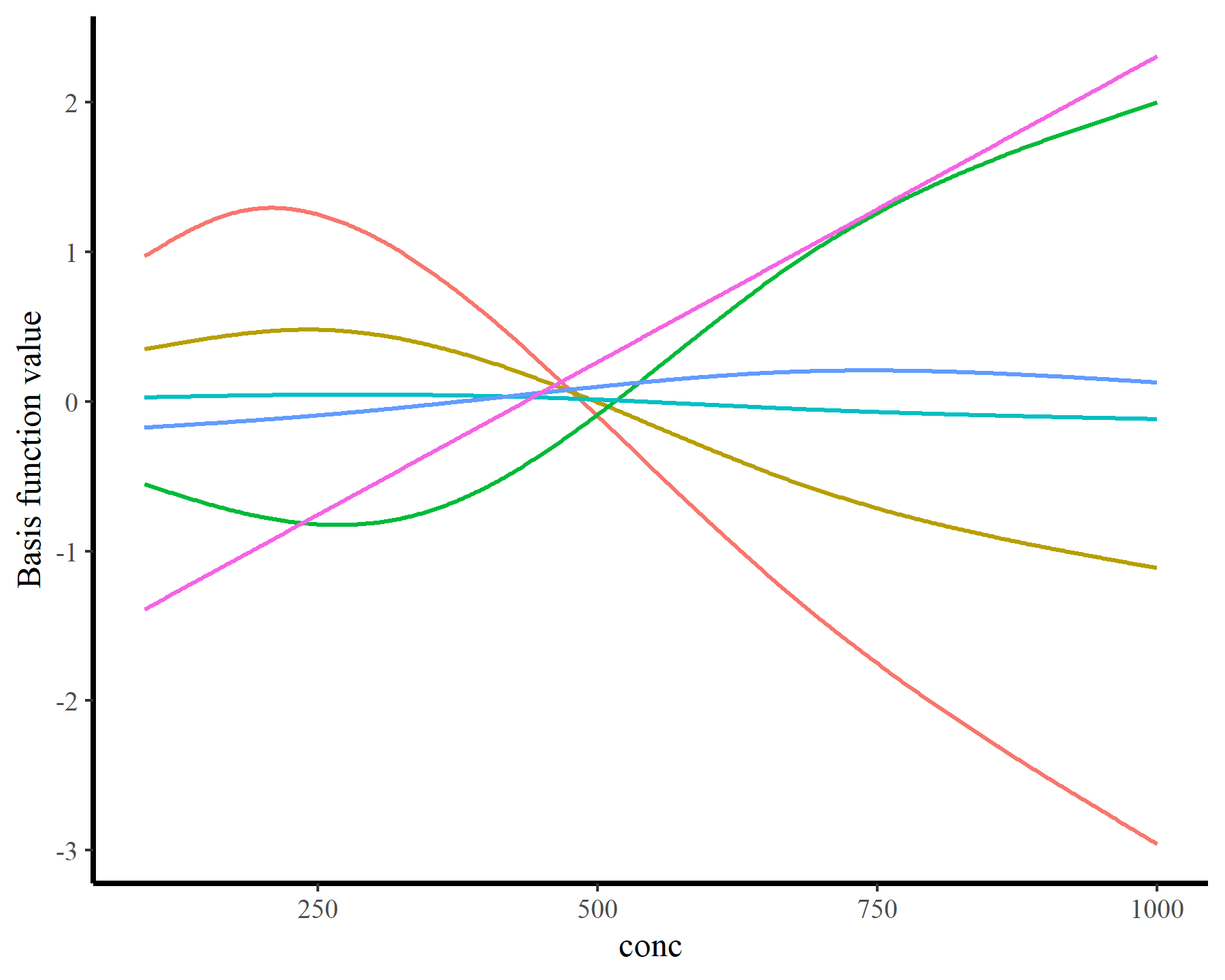
Essentially these steps are what we need to interrogate GAMs. But as you can see, it can be tedious to create the newdata object because we need to specify values for all of the covariates. Even the ones we aren’t interested in (such as plant or type in the above example). This is where the automation from {marginaleffects} becomes so extraordinarily valuable. By using sophisticated rules to automatically set values for missing predictors, creating these newdata scenarios is effortless. The magic happens using the datagrid() function:
newdat <- datagrid(conc = conc_seq, model = model_1)
head(newdat)
##    uptake  treatment   type plant      conc
## 1 27.2131 nonchilled Quebec   Qn1  95.00000
## 2 27.2131 nonchilled Quebec   Qn1  96.81363
## 3 27.2131 nonchilled Quebec   Qn1  98.62725
## 4 27.2131 nonchilled Quebec   Qn1 100.44088
## 5 27.2131 nonchilled Quebec   Qn1 102.25451
## 6 27.2131 nonchilled Quebec   Qn1 104.06814
Here you can see that only the conc variable changes across rows, while all other variables are fixed. You can use ?marginaleffects::datagrid to see what the default rules are for fixing these (and how you can change them if you wish). Combining {mgcv}’s predict.gam(..., type = 'lpmatrix') and {marginaleffects}’s datagrid(...) function gives you all the flexibility you need to ask targeted questions using fake data simulation. In fact, when you call plot_predictions() or plot_slopes(), behind the scenes is a clever run of calls to datagrid() to set up the design matrices.
Sidenote: marginaleffects works for many model classes
Obviously {marginaleffects} is incredibly useful for interrogating GAMs as it provides a clean, simple interface for understanding nonlinear effects. But in fact the power of this framework is much broader, as it can support a huge number of model classes in R (over 100 at the time of writing). This makes model comparison an absolute breeze. For example, let’s fit a GLM with some wacky polynomial interaction effects to the same data (Please note I’m not advocating for this model. No. It is a bad model)
model_2 <- glm(uptake ~ treatment * type +
                 poly(conc, 4) * treatment + plant,
               data = plant,
               family = Gamma(link = "log"))
And we can remake one of the plots of the concentration effect from the GAM that we made earlier
plot_predictions(model_1, condition = c('conc', 'treatment', 'type'),
                 type = 'response', points = 0.5,
                 rug = TRUE) +
  labs(y = "Expected response",
       title = "Average smooth effect of concentration",
       subtitle = "Per treatment, per type")

We can produce the exact same plot, but now with the GLM. Notice how not a single character in the call to plot_predictions() has to change apart from the model argument
plot_predictions(model_2, condition = c('conc', 'treatment', 'type'),
                 type = 'response', points = 0.5,
                 rug = TRUE) +
  labs(y = "Expected response",
       title = "Average smooth effect of concentration",
       subtitle = "Per treatment, per type")
Ok but how do we go beyond these relatively “simple” plots to ask more direct questions from our models?
Step 3: Making useful comparisons with GAMs
In their recent book Regression and Other Stories, authors Gelman, Hill and Vehtari advocate that regression outputs should be interpreted as comparisons. This is helpful because most of our models are descriptive rather than emulations of some causal assumptions we might have about the data-generating process. But it also helps to give us ideas about how we can use regression models to compare different scenarios and ask the model what it thinks might be plausible.
Difference smooths: how does a smooth effect vary among groups?
A recent post on Cross Validated on computing differences among smooths in factor-smooth interactions (which partly motivated this post) provides useful context to help showcase the power of {marginaleffects} for making comparisons in GAMs. The user was interested in fitting the same type of GAM that I fit above (including a factor-smooth interaction) to understand how nonlinear effects vary among factor levels. The question is straightforward enough, but it turns out this can be challenging to calculate by hand. But fortunately we have the family of comparisons() functions from {marginaleffects} to help. These are designed to compare predictions among different scenarios to compute differences, calculate ratios or run any user-specified function (i.e. changes in log odds or elasticities, if we so wish). See ?marginaleffects::comparisons for more guidance.
As an example, we can calculate the average expected difference in uptake values between treatments by aggregating over type and conc. This gives us the “global” effect of treatment, irrespective of type or conc values and can be a useful summary measure
avg_comparisons(model_1, newdata = datagrid(conc = conc_seq,
                                            treatment = unique,
                                            type = unique),
                variables = "treatment",
                by = "type")
##
##       Term                         Contrast        type Estimate Std. Error
##  treatment mean(chilled) - mean(nonchilled) Quebec         -4.76       3.04
##  treatment mean(chilled) - mean(nonchilled) Mississippi   -10.71       2.20
##      z Pr(>|z|)    S 2.5 % 97.5 %
##  -1.57    0.117  3.1 -10.7   1.19
##  -4.87   <0.001 19.8 -15.0  -6.40
##
## Columns: term, contrast, type, estimate, std.error, statistic, p.value, s.value, conf.low, conf.high, predicted_lo, predicted_hi, predicted
## Type:  response
Here we can see that, on the scale of the response, the average difference among treatments is stronger for type = Mississippi than for type = Quebec. This contrast comes with an estimated effect size and p-value, which you can read more about in ?marginaleffects::comparisons
Alternatively, we can target the original poster’s estimand of interest: what is the average difference between treatments across a sequence of conc values (i.e. what is the difference among the smooths?)
avg_comparisons(model_1, newdata = datagrid(conc = conc_seq,
                                            treatment = unique,
                                            type = unique),
                variables = "treatment",
                by = c("conc", "type"))
##
##       Term                         Contrast   conc        type Estimate
##  treatment mean(chilled) - mean(nonchilled)   95.0 Quebec         0.413
##  treatment mean(chilled) - mean(nonchilled)   95.0 Mississippi   -3.114
##  treatment mean(chilled) - mean(nonchilled)   96.8 Quebec         0.373
##  treatment mean(chilled) - mean(nonchilled)   96.8 Mississippi   -3.183
##  treatment mean(chilled) - mean(nonchilled)   98.6 Quebec         0.332
##  Std. Error      z Pr(>|z|)   S  2.5 % 97.5 %
##        1.60  0.258  0.79644 0.3  -2.73   3.55
##        1.02 -3.057  0.00224 8.8  -5.11  -1.12
##        1.61  0.232  0.81662 0.3  -2.78   3.53
##        1.03 -3.102  0.00192 9.0  -5.19  -1.17
##        1.62  0.205  0.83731 0.3  -2.84   3.51
## --- 990 rows omitted. See ?print.marginaleffects ---
##  treatment mean(chilled) - mean(nonchilled)  996.4 Mississippi  -11.426
##  treatment mean(chilled) - mean(nonchilled)  998.2 Quebec        -4.436
##  treatment mean(chilled) - mean(nonchilled)  998.2 Mississippi  -11.427
##  treatment mean(chilled) - mean(nonchilled) 1000.0 Quebec        -4.435
##  treatment mean(chilled) - mean(nonchilled) 1000.0 Mississippi  -11.428
##  Std. Error      z Pr(>|z|)    S  2.5 % 97.5 %
##        2.75 -4.156  < 0.001 14.9 -16.81  -6.04
##        3.97 -1.119  0.26334  1.9 -12.21   3.34
##        2.76 -4.147  < 0.001 14.9 -16.83  -6.03
##        3.98 -1.115  0.26467  1.9 -12.23   3.36
##        2.76 -4.138  < 0.001 14.8 -16.84  -6.02
## Columns: term, contrast, conc, type, estimate, std.error, statistic, p.value, s.value, conf.low, conf.high, predicted_lo, predicted_hi, predicted
## Type:  response
This gives us the expected difference among the two smooths for a broad sequence of conc values. It is extremely useful because it already takes into account any variation in intercepts or other effects where treatment or conc might show up in the model. Of course looking at a returned tibble with 1,000 rows is not very helpful, so we can plot these differences instead:
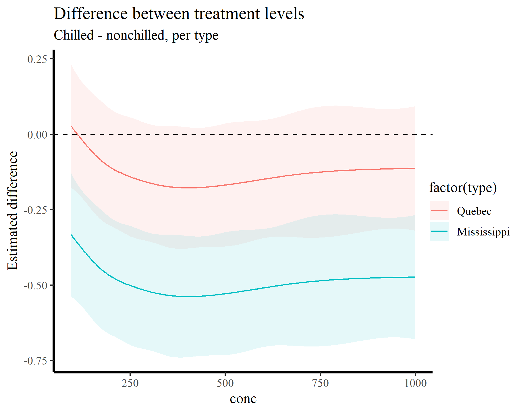
plot_comparisons(model_1, newdata = datagrid(conc = conc_seq,
                                            treatment = unique,
                                            type = unique),
                 variables = "treatment",
                 by = c("conc", "type"),
                 type = 'link') +
  geom_hline(yintercept = 0, linetype = 'dashed') +
  labs(y = "Estimated difference",
       title = "Difference between treatment levels",
       subtitle = "Chilled - nonchilled, per type")
We can also ask questions such as At what values of conc does the nonlinear slope grow the fastest?. This kind of question is extremely useful in time series modeling, for example if we wanted to know when a population trend was increasing (or decreasing) the fastest. Supplying a custom function to the comparisons() function achieves this for us:
max_growth = function(hi, lo, x) {
    dydx <- (hi - lo) / 1e-6
    dydx_max <- max(dydx)
    x[dydx == dydx_max][1]
}

comparisons(model_1,
            newdata = datagrid(conc = conc_seq,
                               treatment = unique,
                               type = unique),
  variables = list("conc" = 1e-6),
  vcov = FALSE,
  by = "treatment",
  comparison = max_growth)
##
##  Term Contrast  treatment Estimate
##  conc   +1e-06 nonchilled      157
##  conc   +1e-06 chilled         151
##
## Columns: term, contrast, treatment, estimate
## Type:  response
Here we can see that, for both treatments, the slope of the nonlinear effect appears to be increasing most rapidly near values of conc = 155.
Or we can ask At what values of conc does the slope differ significantly from zero?. By once again aggregating over type and computing first derivatives across a range of conc values, we can use the hypotheses() function which, by default, asks if a quantity is significantly different from zero:
hypotheses(slopes(model_1,
       newdata = datagrid(conc = conc_seq,
                          treatment = unique,
                          type = unique),
       variables = "conc",
       by = c("conc", "treatment"),
       type = 'link')) %>%
  dplyr::filter(p.value <= 0.05)
##
##  Term    Contrast  conc  treatment Estimate Std. Error    z Pr(>|z|)    S
##  conc mean(dY/dX)  95.0 nonchilled  0.00809   0.000876 9.23   <0.001 65.0
##  conc mean(dY/dX)  95.0 chilled     0.00647   0.000829 7.80   <0.001 47.2
##  conc mean(dY/dX)  96.8 nonchilled  0.00809   0.000875 9.24   <0.001 65.1
##  conc mean(dY/dX)  96.8 chilled     0.00647   0.000829 7.81   <0.001 47.3
##  conc mean(dY/dX)  98.6 nonchilled  0.00808   0.000874 9.25   <0.001 65.2
##     2.5 %  97.5 %
##  6.37e-03 0.00980
##  4.84e-03 0.00809
##  6.37e-03 0.00980
##  4.84e-03 0.00809
##  6.37e-03 0.00980
## --- 196 rows omitted. See ?print.marginaleffects ---
##  conc mean(dY/dX) 278.2 nonchilled  0.00127   0.000503 2.53   0.0114 6.5
##  conc mean(dY/dX) 280.0 nonchilled  0.00122   0.000511 2.39   0.0168 5.9
##  conc mean(dY/dX) 281.8 nonchilled  0.00117   0.000521 2.25   0.0242 5.4
##  conc mean(dY/dX) 283.6 nonchilled  0.00113   0.000535 2.10   0.0355 4.8
##  conc mean(dY/dX) 285.4 nonchilled  0.00108   0.000547 1.97   0.0484 4.4
##     2.5 %  97.5 %
##  2.87e-04 0.00226
##  2.21e-04 0.00222
##  1.53e-04 0.00219
##  7.67e-05 0.00218
##  7.52e-06 0.00215
## Columns: term, contrast, conc, treatment, estimate, std.error, statistic, p.value, s.value, conf.low, conf.high, predicted_lo, predicted_hi, predicted
## Type:  link
Sometimes we might want more specific hypotheses, and these are often readily achievable using {marginaleffects}. See for example
this post on Cross Validated looking into biases of slope estimates from GAMs.
How do I report effects from GAMs in scientific publications?
Hopefully that rundown gives you some helpful tools and tips to interrogate your GAMs. I haven’t dived into multidimensional smooths in this post, but in principle the workflow doesn’t need to change much. You just need to be specific about the types of comparisons you want to make and let {marginaleffects} turn the inference crank. I’ll sum up by attempting to tackle another one of the most common questions I get asked about GAMs: how do I report these things? Here are a few points that I think are valuable for reporting nonlinear effects of GAMs in scientific communications:
- Avoid reliance on p-values and statistical significance. Discretizing these effects into some arbitrary binary classification does nothing but throw out valuable information
- Focus on how these effects influence expected change on the scale of the outcome. We use GAMs and GLMs because we want to model real things in the world that aren’t Gaussian, so we use link functions that are often nonlinear. Interpreting effects on the scale of the linear predictor is hard for everyone
- Use simulations to understand what your model thinks is plausible, and fully describe (and justify) your simulation strategy
- Make comparisons against different models (i.e. polynomial, linear) to get a sense for how sensitive your conclusions are to the choice of functional form
Thanks very much for your time!
Further reading
The following papers and resources offer useful material for working with and interrogating GAMs
Christensen, E. M., Simpson, G. L., & Ernest, S. M. (2019). Established rodent community delays recovery of dominant competitor following experimental disturbance. Proceedings of the Royal Society B, 286(1917), 20192269.
Clark, N. J., Ernest, S. K. M., Senyondo, H., Simonis, J. L., White, E. P., Yennis, G. M., & Karunarathna, K. A. N. K. (2023). Multi-species dependencies improve forecasts of population dynamics in a long-term monitoring study. Biorxiv, doi: https://doi.org/10.32942/X2TS34.
Karunarathna, K. A. N. K., Wells, K., & Clark, N. J. (2024). Modelling nonlinear responses of a desert rodent species to environmental change with hierarchical dynamic generalized additive models. Ecological Modelling, 490, 110648.
Pedersen, E. J., Miller, D. L., Simpson, G. L., & Ross, N. (2019). Hierarchical generalized additive models in ecology: an introduction with mgcv. PeerJ, 7, e6876.
Ross, N. (2019). GAMs in R: a free interactive course using mgcv
Simpson, G. L. (2018). Modelling palaeoecological time series using generalised additive models. Frontiers in Ecology and Evolution, 6, 149.